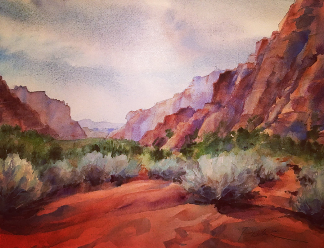
 Snow Canyon Sonnet, 12 x 16, original watercolor, unframed. Snow Canyon is one of the most beautiful and amazing places in Utah, although lesser-known than its cousin up the highway, Zion National Park. At Snow you can find every combination of lighting, every range of color from cool to warm, muted to saturated, and every texture, from smooth sand dunes to rippled ridges to craggy cliffs to scrubby sage. Like much of the desert, there is striking contrast everywhere you look. There is also a surprising amount of water, if you know where to look for it—especially for a desert. And it feels like you can see forever.
This scene may look a little familiar if you've been following my work. This is from the the same view as "Snow Right After Rain," that was so popular at my last show. A couple of people requested a horizontal version of that landscape, so this is an attempt at the horizontal format. I may eventually develop it into a larger piece. But for now I'm happy with it as is. Sometimes I think I could be perfectly content painting nothing but Southern Utah. But I have to confess, I love the vast variety of landscape here. The mountains, lakes, canyons and forests of Northern Utah are just as captivating as the red rocks and arches of the southern half. One thing that adds an extra degree of integrity to my Southern Utah landscapes is the Primatek mineral pigments made by Daniel Smith. I own almost a complete set, and I find they render the colors and textures of this region better than anything else I've seen or used. Part of the reason is they're ground directly from actual minerals, some from this very area. I also love the way they separate and granulate, and even sparkle—not like fake glitter, but with a natural luminescence coming from the minerals themselves. QUESTION: What is your favorite area to explore in Southern Utah? or near you?
0 Comments
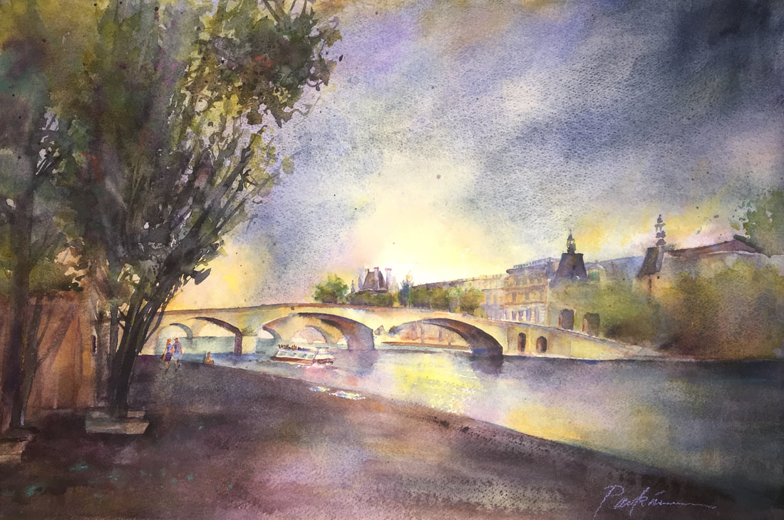 Paris is legendary as a city of romance, and to me this images captures that sense. We were strolling on the banks of the Seine at dusk, having just taken an evening boat ride and watched couples dancing to music under the lights outside a cafe. The weather was warm, the sky was dramatic, and while the shadows deepened and stretched before us, the moonlight gave the river a beautiful glow. Everything looked soft and romantic. This is Paris at her best.
This painting sold before I even had a chance to post it to the website. But I thought I'd share it here on the blog. "Moonlight on the Seine" 15 x 22 Collection of James and Margaret Leight California 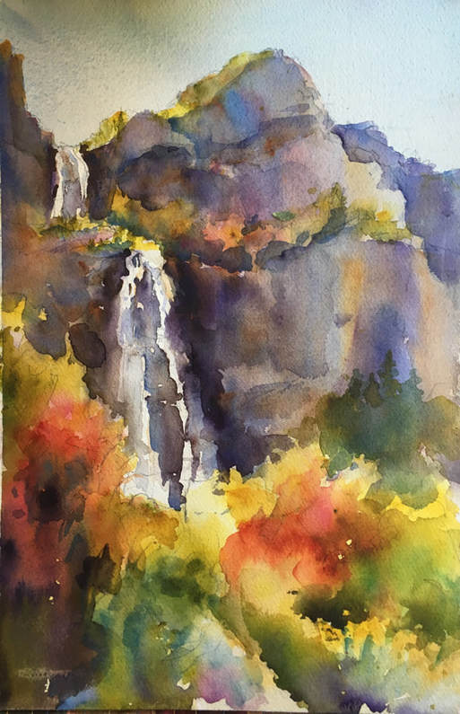 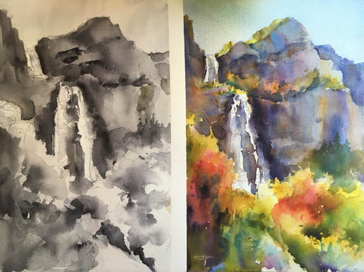 Bridal Veil Falls, October 2017. Top: completed painting. Bottom: Value Study and color painting side by side for comparison. This was painted on location at the base of Bridal Veil Falls. We had one perfect fall day (65 degrees and sunny), one freezing cold day (44 degrees, with a light rain that cause us to stop early) and one windy day where the gusts whipped my painting right off my easel and up into the air. (A student found it trapped between a tree and a boulder and rescued it for me.) Fall is my favorite time to paint outdoors. The vibrant colors are a constant source of inspiration, and the temperature usually feels just right. (Such a relief after the blazing hot days of summer!) But working outdoors presents its own set of challenges. The light changes. The weather changes. The paint dries faster...or slower, if it's extra humid outside. And then there's the whole daunting idea of facing a giant panorama of scenery. How to decide what to paint, what to leave out, and what to simplify. Following are some tips that have served me well when I venture outdoors to get my fill of gorgeous scenery and fall color: 1. Start with a sketch. In a sketchbook you can solve problems in advance that will save you regret down the road, helping to ensure success. I use the Aquabee Super Deluxe All-Media Sketchbook, in a variety of shapes and sizes. True to its name, it accepts a wide variety of media, including ink, charcoal, pencil, markers, and of course watercolor. 2. Simplify. Don't try to paint the whole landscape, or every little detail. Less is more. Decide what drew your attention most to the scene, and zoom in on that. Use your hands to crop in on an area. Squint to simplify shapes and values more easily. (I think I have permanent crow's feet now from squinting all the time!) 3. Do a value study. Lots of artists skip this step. Let's face it, the fun part is the color, right? But I'll let you in on a little secret: Value does all the work; Color takes all the credit. If you solve the problems of value and composition in a value study, you then have a map for the color portion of your painting, with so many decisions worked out in advance. When I skip this step the paintings are never as successful, so value studies are an always for me now. 4. Match your value study wash for wash. I don't always do this. Sometimes it's faster and easier to work out the values first and then proceed to the finished painting. But matching your values wash for wash really helps keep you focused on the shape at hand and not get distracted or pulled away by non-essential details. It also gives you the advantage of allowing for a little drying time between washes while you're working on the other side. 5. Combine objects into clusters. For example, a grove of pine trees is a single shape with pine-tree-esque texture on the edges—NOT seventeen (or however many) individual trees! The same goes for foliage. Look for overall shapes with interesting edges, rather than trying to capture leaf after leaf after leaf, or even shrub after shrub. 6. Be fresh and free with your color. It turns out Mother Nature is a master at this. Color variation is her middle name. (Or it should be!) Don't get stuck in the trap of making colors too literal. Believe it or not, they'll actually be MORE realistic if you imitate nature herself and include a variety of color in every shape. Tree trunks are not brown...they're a range of colors, including purple. Rocks are not grey. They are a variety of colors, including combinations of warm/cool complements: blue and russet, purple and gold, etc. Allow these colors to mix on the paper rather than stirring them into a muddy soup on your palette. Your painting will thank you. 7. Organize colors into larger shapes for stronger impact. One of my students looked at the hills dotted with fall colors and said, "The canyon looks like a bowl of fruit loops!" I like that description. But focusing on dots of color can get you into trouble. Here you need to understand broken color: Small dots of two or three colors combine visually to make a third color which is a combination of the dots. For example, Blue dots plus yellow dots = green dots. So painting lots of little dots of green and orange and red (the trees we see covering a hillside with bits of fall color) will combine visually to create...brown. Ugh. The opposite of what you're trying to achieve. Instead, take sections of foliage and assign them a color...make bunches of neighboring shrubbery in a single shape of red, or orange or green. Now these colors are large enough to stand on their own, with the impact you were after. Okay, those are my secrets for successful painting outdoors on location. Venture out with confidence! QUESTION: What are your best tips for painting on location?  Eser Balci: My Muslim Neighbor, with his son Turk. Eser used to play professional soccer in Turkey. But after a bad knee injury he was unable to continue. He didn’t get the surgeries required to heal properly, so he had to change careers. He and his family have recently returned to Turkey, but while they were here he was teaching Turkish language classes at BYU and studying mathematics there.
I first met Eser at a neighborhood barbecue we held in our back yard the week after they moved in. Later that summer we had a huge project in our front yard. The city had diverted the water that flowed through our yard in the springtime, offering to provide the necessary dirt to fill in the resulting empty ditch in our front yard. What we didn’t know was that meant they dumped a huge mountain of dirt at the top of the driveway and we had to fill the ditch ourselves, a shovelful at a time. As soon as Eser saw us out there working, he came out with a shovel and joined in. Every day, out there in the hot sun, Eser was digging alongside my husband and our son. If we were working, he was working. That was our first REAL introduction to Eser. He is a wonderful neighbor. Eser liked being in Provo. He loved our quiet cul-de-sac, and thought this was a great place to raise a family. He and his wife Leanna, who is from the U. S. and met Eser while she was a grad student in Turkey, have three adorable little boys: Turk, Tek, and Ike. Despite loving the atmosphere in Provo, Eser also said he missed Turkey. He especially missed his family there, and the food, and his friends—just like any of us might feel if we were living abroad. And just like any of us, they worry about everyday things like whether their lawn is mowed, juggling busy schedules with raising a family, and the boys messing up the house. There are also many things we share in terms of our faith. Muslims believe in one God, and not even allowing the existence of any other deity. They have a strict set of guidelines they follow, including dietary restrictions. Eser pointed out that—different from what you might see on the news—Islam is a peaceful religion. Eser said many people misunderstand the term “jihad” or holy war. He said it doesn’t mean to go out and kill non-believers. It’s about defending and protecting your home and your faith when attacked, not unlike the Standard of Liberty. He said there is a line in the Quran about killing non-believers that is frequently taken out of context, but they are a peaceful people. Much of that peacefulness is grounded in respect, which is a very important principle to Muslims. They don’t believe in putting themselves above any other person, but rather in treating others with complete respect. The prophet Muhammud taught that all people are equal, no matter the color of their skin or any other distinction. (Again, not unlike the utopian society in 4th Nephi, where there is “no contention, and no manner of -ites"). There is an idiom in Turkey, “Before you buy a house, buy a neighbor.” Well, Eser has bought us. We loved having him and his family here, and we hope we are as good to him as he is to us. We look forward to their return in a year or so. 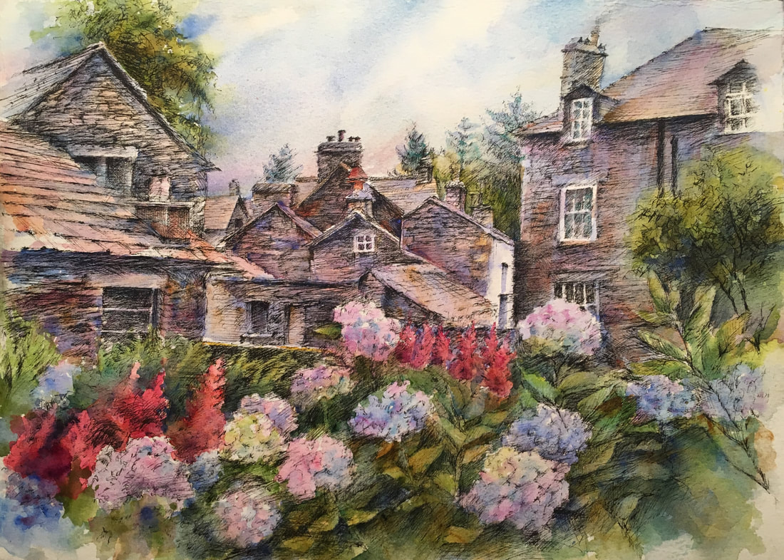 This was my third trip to the Lake District, one of the loveliest places on earth. The first time I went, I was a college student, and I honestly felt like I'd died and gone to heaven. I could not suppress the joy.
The Lake District hearkens back to a time when everything was kinder, simpler, quieter, and nothing competed with the natural world it revered. Stacked stone walls divide pastures of sheep, and everything feels just right, the way each stone is carefully selected to fit perfectly with the stones above and beneath. A metaphor for our thoughts and our lives, which yearn to find order in chaos. The climate is a rich, humid invitation for growth, and oh, how the flowers respond! I caught this view as I was leaving Dove Cottage, Wordsworth's beloved home in Grasmere. His words are far better than mine at describing life in the Lake District, and its conduit to the heavens: "How does the Meadow flower its bloom unfold Because the lovely little flower is free Down to its root, and in that freedom bold. and... "a sound and healthy friendship is the growth of time and circumstance, it will spring up and thrive like a wildflower when these favour" and... "'Be thankful, thou; for, if unholy deeds Ravage the world, tranquillity is here!'" Oh, how the world needs that tranquility today! I'm so grateful this timeless place has been preserved for all to experience. Question: Where do you go to find freedom, growth, and tranquility? 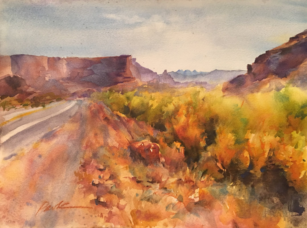 I had a rare opportunity to travel to Arizona for a watercolor workshop from a famous Chinese artist, and visit my sister Emily in Gilbert at the same time. I convinced her to take the workshop with me, so we could paint alongside each other like we did when we were younger.
This is a sister with so much natural talent for watercolor, and an innate freedom and freshness in her work. But she rarely takes the time to create. About 20 years ago, I had a client in Santa Cruz commission 24 watercolors to illustrate their fragrance line. I knew there was no way I could complete all 24 by their deadline, so I enlisted the help of my sister, and hired her to create several of the paintings. To this day, you cannot tell which are hers and which are mine. Our styles are that similar. I was driving to her house, anticipating this gift of time with my sister, painting together. The radio, wifi and cell service had drifted out long ago, and I was alone with my thoughts when I reached this section of highway. I was so stunned by the beauty...the layers of mesas fading into the distance, the red rocks of the middle ground, and the vibrant foliage in the foreground, I pulled off to the side of the road to take a picture. I finally painted it last fall, using a favorite palette comprised mainly of Daniel Smith's Primatek mineral pigments, plus a few rich transparents for glazing. This is the result. I love the authenticity of both color and texture these mineral pigments bring to a landscape. Last month "Arizona Highway" was juried into the Utah Watercolor Society Fall Show which opens tomorrow (October 6) at the Bountiful Davis Art Center. Come see the original (plus two larger pieces) this weekend. "Arizona Highway" Utah Watercolor Society Fall Show October 6 -November 17, 2017 Bountiful Davis Art Center 90 N Main St. Bountiful, UT 84010 Opening reception: Oct. 6, 7:00 pm 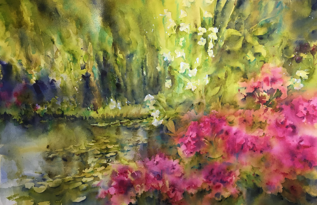 Monet's Garden, original watercolor, 15 x 22, It started with a train ride from Gare St. Lazare train station in Paris, a site many of the great impressionist artists have captured. We rode to Vernon, a small town in the French countryside, to rent bicycles and buy french bread, and other lunch essentials.
We rode through the town and over a lovely stone bridge to the other side off the Seine, where we stopped on a grassy knoll to picnic on the banks of the river. Rested and well-fed, we mounted our bicycles again and pedaled through the French countryside, past stone cottages, whitewashed fences, lovely gardens, and line after line of fresh laundry drying in the sun. Finally we arrived in Giverny, and queued up to tour Monet's home and garden. The line was long and the day was warm, but there was an ice cream kiosk conveniently located right across the street. And soon we were inside. It was a dream come true to see the lovely home where Monet and his wife Camille lived out their days, and to tour the garden that inspired so much of his later work. This is his famous and beloved lily pond, framed by an array of brilliant-colored flowers and shaded by mighty willow trees. Then we rode back again through the countryside, past the laundry and the stone cottages, the bridge and the river, returned our bicycles and boarded a train back to Paris. Best day ever. In this painting I tried to capture my joy at visiting this longed-for place, the serenity of the garden and pond, and a touch of the impressionism Monet himself used to describe his garden. "Monet's Garden" original watercolor, 15 x 22. On display at the UVU Faculty Show, Oct. 5 - Dec. 9, 2017. Woodbury Museum (University Place, Second Floor). 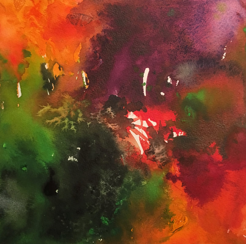 Baby Kale, Shredded Carrots, Red Peppers, Red Cabbage, Cilantro and Almonds I was hosting a dinner party, and the main dish was Korean Barbecue. I needed an asian-themed salad that would satisfy my foodie friends. I did a quick google search and landed here. (My new favorite cooking site.) I'm not the biggest fan of kale, nor would I ever choose red cabbage necessarily. But the description promised I'd be munching my kale happily, or rather "eating your vegetables (and most surprisingly kale) with pleasure and abandon." How could I resist?
I made the salad, and everyone raved! All the pleasure and abandon, as promised. But what surprised me the most was the incredibly gorgeous combination of colors. It inspired my first painting in my Foodie Abstract series: "Asian Kale Salad (curly kale, carrots, red cabbage, red pepper, cilantro and almonds)". This image embodies for me not just the beautiful colors, textures and flavors of the salad, but also the laughter, friendship and joy that resulted in the dinner party where this salad debuted. This is the first in my Foodie Abstracts Series, and the salad that truly pushed me beyond the idea phase and into my studio moving paint around with the same kind of pleasure and abandon released in the flavors. Thank you, Jenn! Recipe By Jennifer Segal, Once Upon a Chef Salad Ingredients:
Question: Do you have a favorite recipe that has beautiful colors involved? Tell me in the comments below! |
AuthorI am an artist and art instructor working in water media. Just knowing I can watch colors run together makes it worth getting out of bed every morning! Helping students capture the same excitement is equally rewarding. Archives
April 2023
Categories |
 RSS Feed