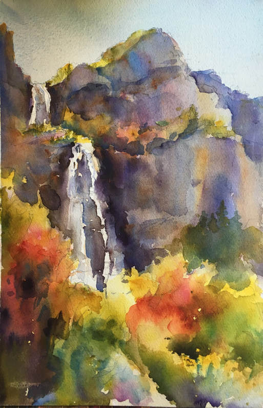
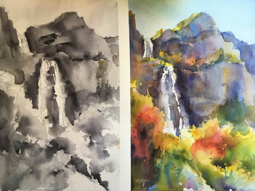
  Bridal Veil Falls, October 2017. Top: completed painting. Bottom: Value Study and color painting side by side for comparison. This was painted on location at the base of Bridal Veil Falls. We had one perfect fall day (65 degrees and sunny), one freezing cold day (44 degrees, with a light rain that cause us to stop early) and one windy day where the gusts whipped my painting right off my easel and up into the air. (A student found it trapped between a tree and a boulder and rescued it for me.) Fall is my favorite time to paint outdoors. The vibrant colors are a constant source of inspiration, and the temperature usually feels just right. (Such a relief after the blazing hot days of summer!) But working outdoors presents its own set of challenges. The light changes. The weather changes. The paint dries faster...or slower, if it's extra humid outside. And then there's the whole daunting idea of facing a giant panorama of scenery. How to decide what to paint, what to leave out, and what to simplify. Following are some tips that have served me well when I venture outdoors to get my fill of gorgeous scenery and fall color: 1. Start with a sketch. In a sketchbook you can solve problems in advance that will save you regret down the road, helping to ensure success. I use the Aquabee Super Deluxe All-Media Sketchbook, in a variety of shapes and sizes. True to its name, it accepts a wide variety of media, including ink, charcoal, pencil, markers, and of course watercolor. 2. Simplify. Don't try to paint the whole landscape, or every little detail. Less is more. Decide what drew your attention most to the scene, and zoom in on that. Use your hands to crop in on an area. Squint to simplify shapes and values more easily. (I think I have permanent crow's feet now from squinting all the time!) 3. Do a value study. Lots of artists skip this step. Let's face it, the fun part is the color, right? But I'll let you in on a little secret: Value does all the work; Color takes all the credit. If you solve the problems of value and composition in a value study, you then have a map for the color portion of your painting, with so many decisions worked out in advance. When I skip this step the paintings are never as successful, so value studies are an always for me now. 4. Match your value study wash for wash. I don't always do this. Sometimes it's faster and easier to work out the values first and then proceed to the finished painting. But matching your values wash for wash really helps keep you focused on the shape at hand and not get distracted or pulled away by non-essential details. It also gives you the advantage of allowing for a little drying time between washes while you're working on the other side. 5. Combine objects into clusters. For example, a grove of pine trees is a single shape with pine-tree-esque texture on the edges—NOT seventeen (or however many) individual trees! The same goes for foliage. Look for overall shapes with interesting edges, rather than trying to capture leaf after leaf after leaf, or even shrub after shrub. 6. Be fresh and free with your color. It turns out Mother Nature is a master at this. Color variation is her middle name. (Or it should be!) Don't get stuck in the trap of making colors too literal. Believe it or not, they'll actually be MORE realistic if you imitate nature herself and include a variety of color in every shape. Tree trunks are not brown...they're a range of colors, including purple. Rocks are not grey. They are a variety of colors, including combinations of warm/cool complements: blue and russet, purple and gold, etc. Allow these colors to mix on the paper rather than stirring them into a muddy soup on your palette. Your painting will thank you. 7. Organize colors into larger shapes for stronger impact. One of my students looked at the hills dotted with fall colors and said, "The canyon looks like a bowl of fruit loops!" I like that description. But focusing on dots of color can get you into trouble. Here you need to understand broken color: Small dots of two or three colors combine visually to make a third color which is a combination of the dots. For example, Blue dots plus yellow dots = green dots. So painting lots of little dots of green and orange and red (the trees we see covering a hillside with bits of fall color) will combine visually to create...brown. Ugh. The opposite of what you're trying to achieve. Instead, take sections of foliage and assign them a color...make bunches of neighboring shrubbery in a single shape of red, or orange or green. Now these colors are large enough to stand on their own, with the impact you were after. Okay, those are my secrets for successful painting outdoors on location. Venture out with confidence! QUESTION: What are your best tips for painting on location?
1 Comment
5/24/2019 08:34:57 pm
Painting should not be done through technique, painting should be done from the heart. In my opinion, no amount of technique can make up for a lace in heart. I really do want to make the best of my skills, however, I believe that my heart is not in the right place. All the paintings that I do are just lacking something. I hope that I can find my passion and transfer it to my work, I really do hope. Leave a Reply. |
AuthorI am an artist and art instructor working in water media. Just knowing I can watch colors run together makes it worth getting out of bed every morning! Helping students capture the same excitement is equally rewarding. Archives
April 2023
Categories |
 RSS Feed