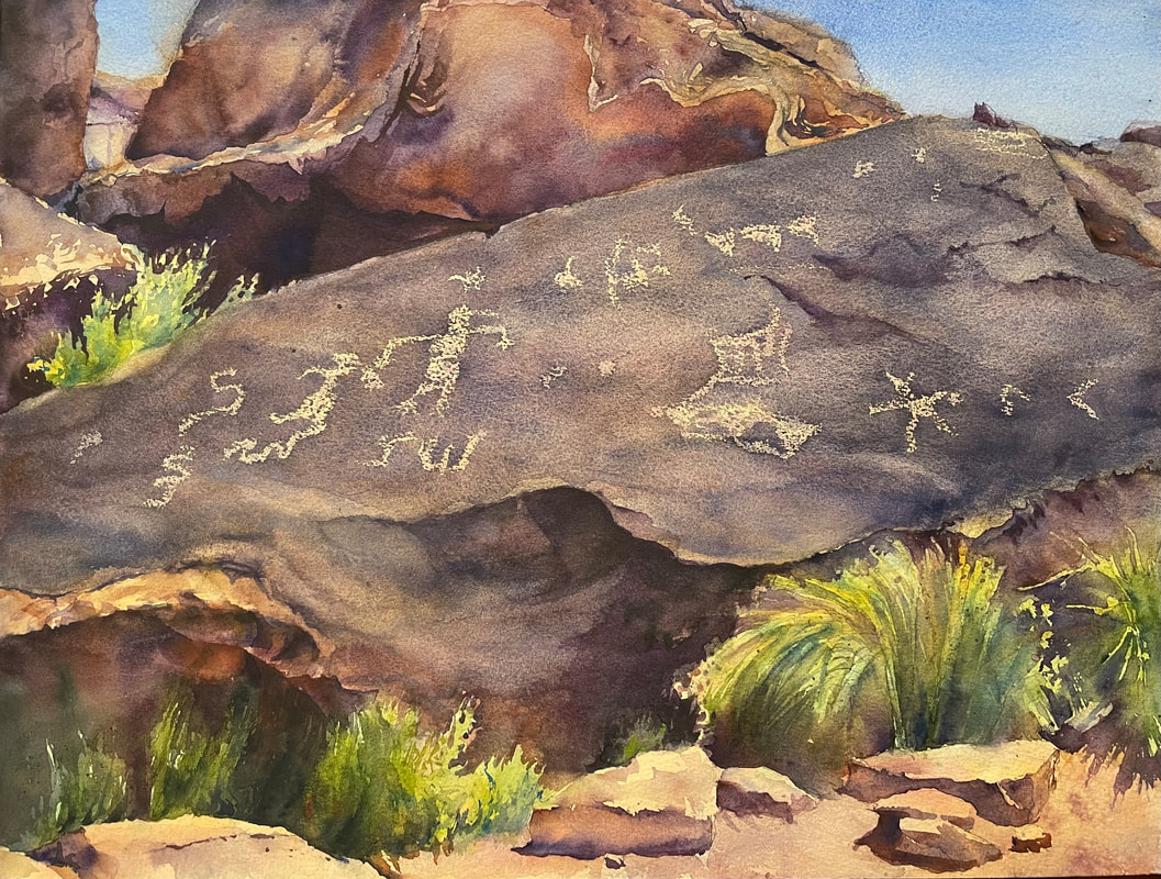
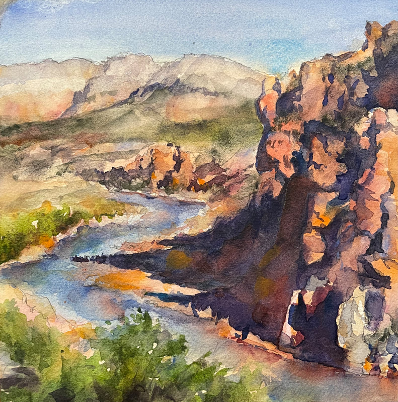
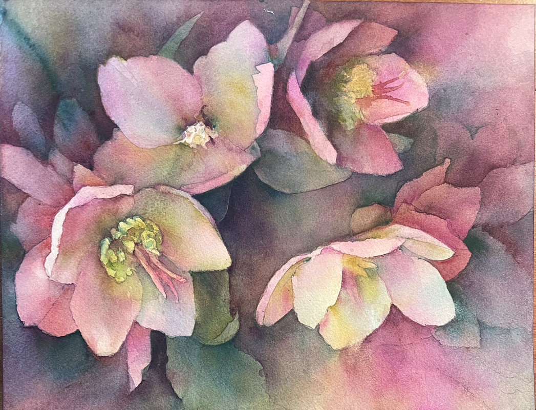
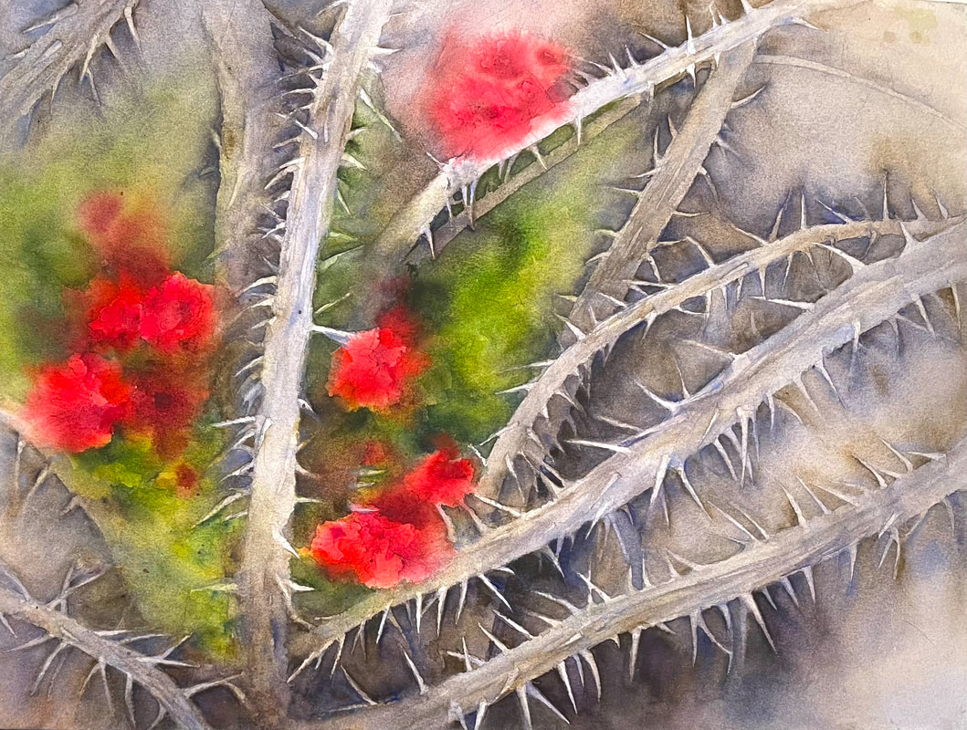
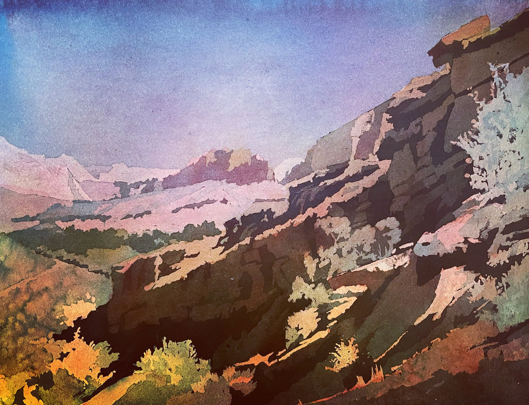
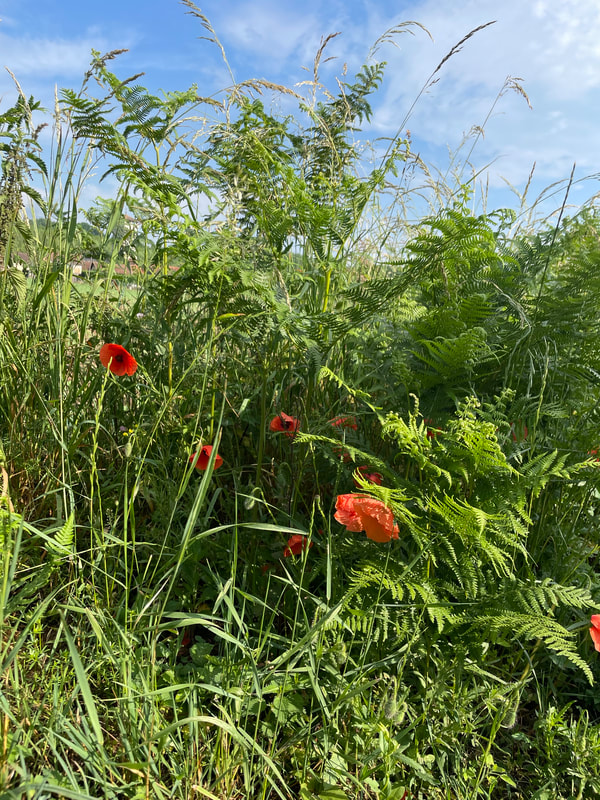
 "Ancient Prophecies," 14 x 19 original watercolor, unframed. Part of my Desert Metaphors series. A couple of years ago my husband and I were guests on a television talk show, "Come Follow Up." In a pre-show conversation, one of the hosts asked me about my artwork, which is mostly landscapes and figures, and asked, "Do you ever do any religious art?" My answer: "They're all religious." This is a fairly frequent question I get from collectors, and to be honest, my answer varies. But I assure you, they are all religious. People are usually surprised to hear this, as it’s not always obvious at first. There are at least three levels of spirituality in my works, three ways they are extensions of my faith, and build faith in others. One of course is overtly religious subject matter, including books, illustrations, paintings of temples and other religious symbols and structures. More often I make paintings in which there is nothing overtly religious, but the title gives a clue as to my presence of mind, and the thoughts and experiences that inspired them. These paintings are filled with rich meaning. I have a Desert Metaphors series, which at first glance is just a set of desert landscapes—lots of sagebrush and red rocks—yet, if you read the titles, each painting is symbolic of Holy Week, from palm fronds to drops of blood to a stone rolled away. Planning for this series — a few days in the wilderness — was one of my most deeply spiritual experiences, as I suddenly saw symbols of the Savior everywhere, surrounding me, in a desert not unlike the one where Jesus walked. A couple of years ago I created a week's worth of Desert Metaphors paintings for Holy Week. I posted them daily on instagram, and sent out a daily email with longer descriptions and larger images. This year I felt inspired to do something similar. I created seven entirely new paintings, each symbolic of some aspect of the atonement. I posted these with very brief descriptions on social media, and am including them as a complete set here. (If you would like to see all of these Desert Metaphors paintings, along with their descriptions, including those from previous years, click here.) "Living Water," "Lenten Roses," and "Crown of Thorns 2" from my Desert Metaphors series. "And With His Stripes," "He Went into a Garden to Pray," and "Springing up into Eternal Life," from my Desert Metaphors series. In many ways, plein air painting — painting outdoors, in nature — provides my most direct connection to the divine. Being in nature is serene and healing. It is like God allowing us to create in His own studio. Many times I cannot contain the bliss I feel as I stand there in awe of the beauty, and at the same time in deep humility, as I attempt to capture and imitate His works. Painting in this way is absolutely worshipful. Often my heart cries out in gratitude and praise.
Question: What activity connects you to your Creator? In what ways do you attempt to express the inexpressible? In what ways are you rewarded for those efforts?
1 Comment
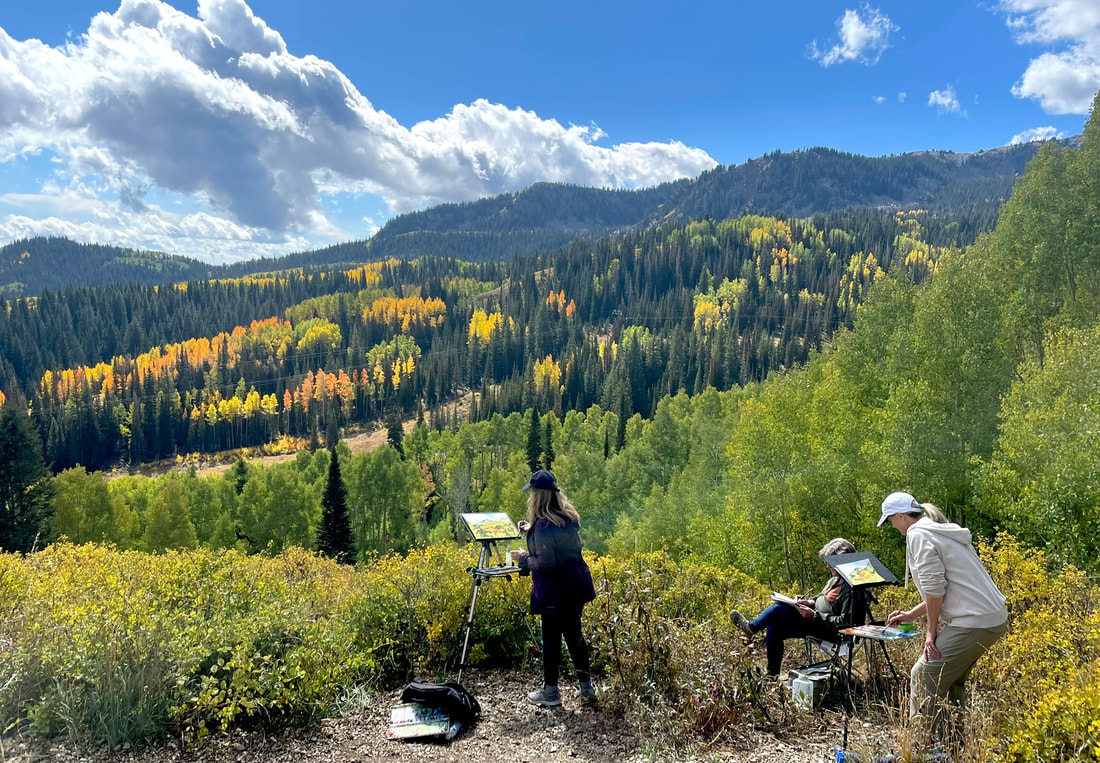
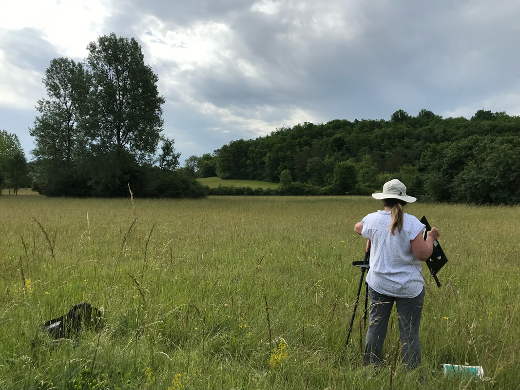
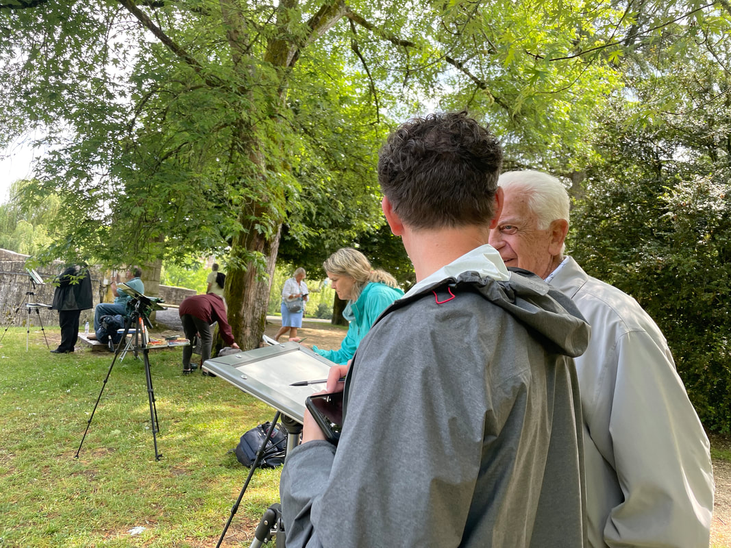
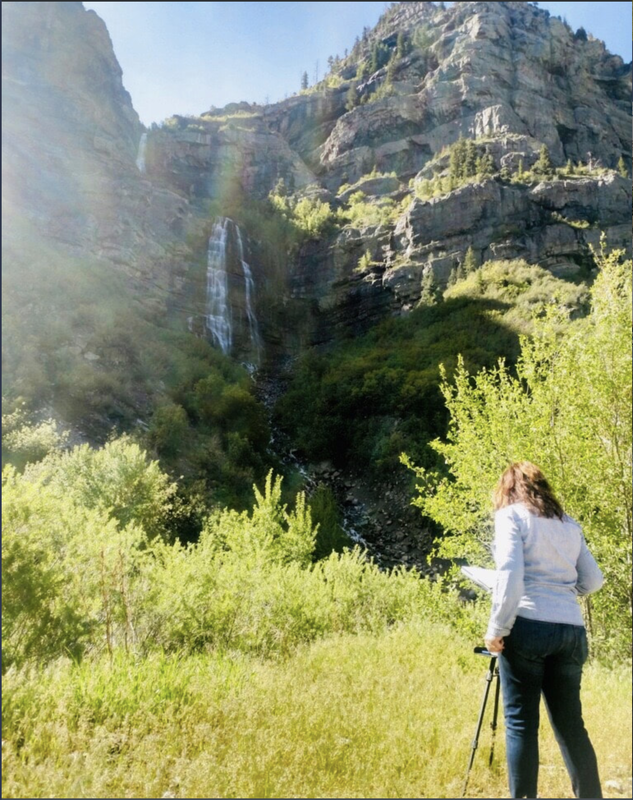 Jana painting en plein air at Bridal Veil Falls in Provo Canyon. Few things bring me more joy than painting -- and especially plein air painting: Being immersed in nature, imitating creation! It is part mindfulness, part worship, with a soundtrack of rushing water and random birdcalls.
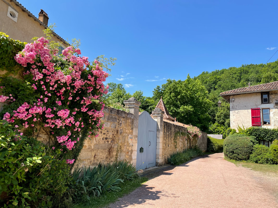
Why is it so difficult to make time for something so blissful and creative, and even social? My students really struggle with this dilemma. And I totally get it. I'm a wife and a mother too. There's always something that needs to be done around the house. As the adage goes, a woman's work is never done. (Sad, but true.) Writer Anne Lamott, in her essay "Time Lost and Found," asserts that "time spent quietly in beauty" is absolutely essential for our mental and emotional well-being. She concludes: "I’ve heard it said that every day you need half an hour of quiet time for yourself, or your Self, unless you’re incredibly busy and stressed, in which case you need an hour. I promise you, it is there. Fight tooth and nail to find time, to make it. It is our true wealth, this moment, this hour, this day." In that spirit, allow me to share some things that have helped me whittle away at my 24 hours each day to carve out time to explore and create. 1. The Full-Focus Planner: Productivity guru Michael Hyatt encourages you to shorten, rather than lengthen, your to-do list every day. To do this, you focus on the "Big 3," and getting those done first, and fit in the less important tasks around them, eliminating those that are unnecessary. Sometimes Plein Air painting is one of my Big 3, sometimes, just making half an hour to draw and paint shows up on my list. But I have learned after years of living with a creative brain that if you don't plan for it, it won't happen. —Seriously, though. This planner has changed how I work, how I think, and what I accomplish. I have used it faithfully since it first launched in 2017. Without this specific planner, there would be no Kitchen Alchemy cookbook, no painting trip to France, and several missed deadlines for shows. You get the picture. These are beautiful leather-bound volumes with two different ribbon bookmarks, and beautiful typography on the inside. The planners ship to your door a year at a time (four volumes). Priceless. 2. Instacart: I signed up for this service when our son-in-law got a job on their finance and strategy team, just to be supportive and see what it was like. But I quickly realized it was a game-changer. Some Saturdays I could either walk the dog up the canyon, or go shopping at Costco. Instacart made that decision easy. Other days I can either paint for two hours, or waste an afternoon running to three different stores to get all the ingredients for tonight's dinner. Over the past 18 months I have saved nearly 200 hours (not a typo) by relying on instacart to free up my schedule. That's a lot of time to paint, write, think, or walk the dog! (Save $30 when you use this link at Instacart, or enter this code at checkout: J3A1C09143) (Note: I sometimes hear people say they can't afford Instacart, which has a small mark-up at some stores, and asks you to tip their drivers. (There is also a small delivery fee, but I get free delivery because I signed up for their Instacart Plus service.) So I did a little experiment. I added everything I needed at Costco in my instacart app. The total was $55. Then instead of ordering, I actually went to Costco and picked up those same items, plus a few random deals I found in the aisles. The total was over $200. True story. Avoiding impulse purchases alone will save you a fortune, let alone the time involved. Plus, use the coupon above to save $30 instantly on your first order.) Bottom line: you can't afford NOT to use InstaCart. 3. Dream Dinners: Ever since our days in Pasadena, when I was running a design studio out of our house, I have relied on freezer meals when I was in a pinch. My favorite of all of these is Dream Dinners. The meals are easy to prepare and delicious. Most are ready to serve in under 30 minutes. There is a wide variety of meals to select from, and the specialty ingredients alone will save you money and a trip to the store. Order only the meals your family will love, out of the available monthly options. Assemble them yourself onsite, or have them delivered. Even though I love to cook, having a backup of freezer meals is a godsend, and my family loves them! They have options for crockpot, stovetop, oven, instant pot, whatever works best for you and your schedule. Meals can also come gluten-free, Keto-friendly, whatever you need. I have experimented with lots of different grocery box plans in the past, but Dream Dinners offers the most flexibility and the best options. It's more affordable and doesn't spoil if you suddenly don't have time to make it that night. Dream Dinners is a lifesaver for us! It saves an average of 2 hours a meal, including shopping, prep and clean-up. 4. Our Place non-stick cookware. At first glance this doesn't seem like it would save much time at all, but here's the deal. These pieces are so beautiful and colorful, you can leave one (or more) on your stovetop as part of your kitchen decor. Best of all, they have the best non-stick surface of any cookware I've used! Eggs slide right off onto a plate. And clean-up is a breeze. Pan at the ready? Truly non-stick? Fastest, easiest clean-up ever? You just bought yourself at least 30 minutes per meal. Totally worth it. (I own 5 pieces from this company, and love them all!) Use this link to save $20. I'd also love to hear what works for you! Please leave your answers and suggestions in the comments below. Note: A few of these are affiliate links--they are the ones that also save you money! :) 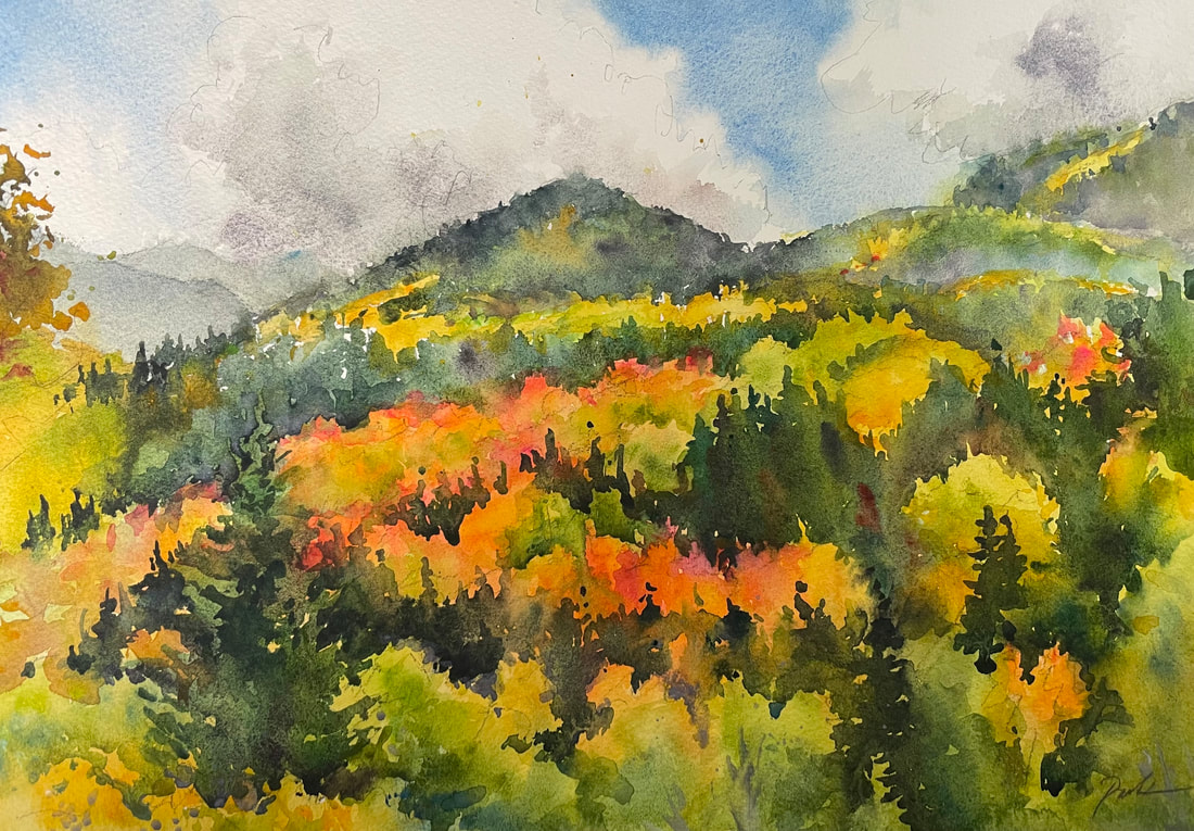 Fluorescent Color at Guardsman Pass, original watercolor, 10 x 14. --SOLD. This year the fall was short, but spectacular! I know I've already mentioned what a mindful and blissful experience plein air painting is, immersing yourself in nature and beauty and wonder and active expression. So many are finding a rich creative and social experience as we paint outdoors. While I'm constantly scoping out great painting locations — shade, accessibility, parking, restrooms, water, etc. — I rarely paint this close to a heavily-trafficked trail. But this spot was too good to pass up! We found the perfect place to set up our easels, just a few steps off the trail, with an amazing view of the colorful mountains in the distance. Sometimes the clouds would lift and the sunlit color would cause all three of us to gasp over the resulting beauty. Lots of hikers stopped to admire our work. Sometimes it's fun to get continual feedback and encouragement as you work! At one point an entire wedding party traipsed back up the trail, and the bride herself asked if I sell my work (yes!)—and if this painting I was working on was for sale. (also yes!) It turned out that it was her birthday that very day, and her destination wedding the next day. When she heard how much the painting cost, she looked a bit crestfallen. But then her family and friends said, "Let's all pitch in!" We exchanged contact info (the painting wasn't quite finished yet) and then the bride got the most amazing and memorable keepsake from her wedding weekend! This is only the third or fourth time I have sold a painting right on the trail. It was exciting for them and for me! If you want your own trailside keepsake, most of my other plein air demos are on sale right here, where you can buy them at the stellar rate of 40% off! (If you're interested in joining me for future Plein Air Friday adventures (we'll start again next spring) you can sign up for the group email right here.) Our little plein air group; the wedding party that stopped by to watch; close-up on my easel.
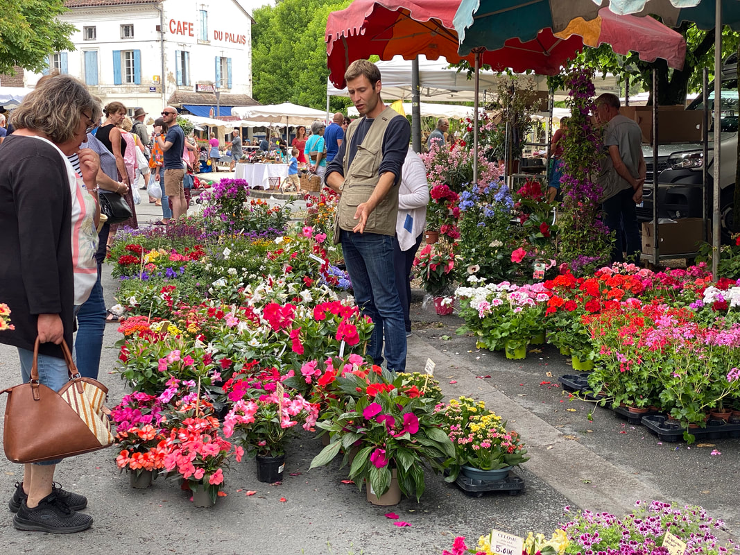
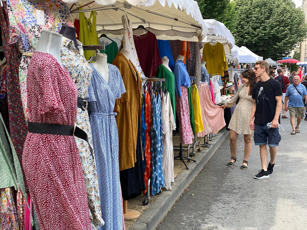
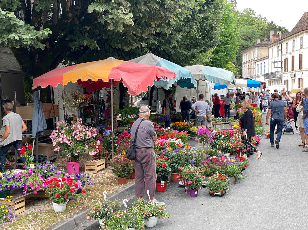
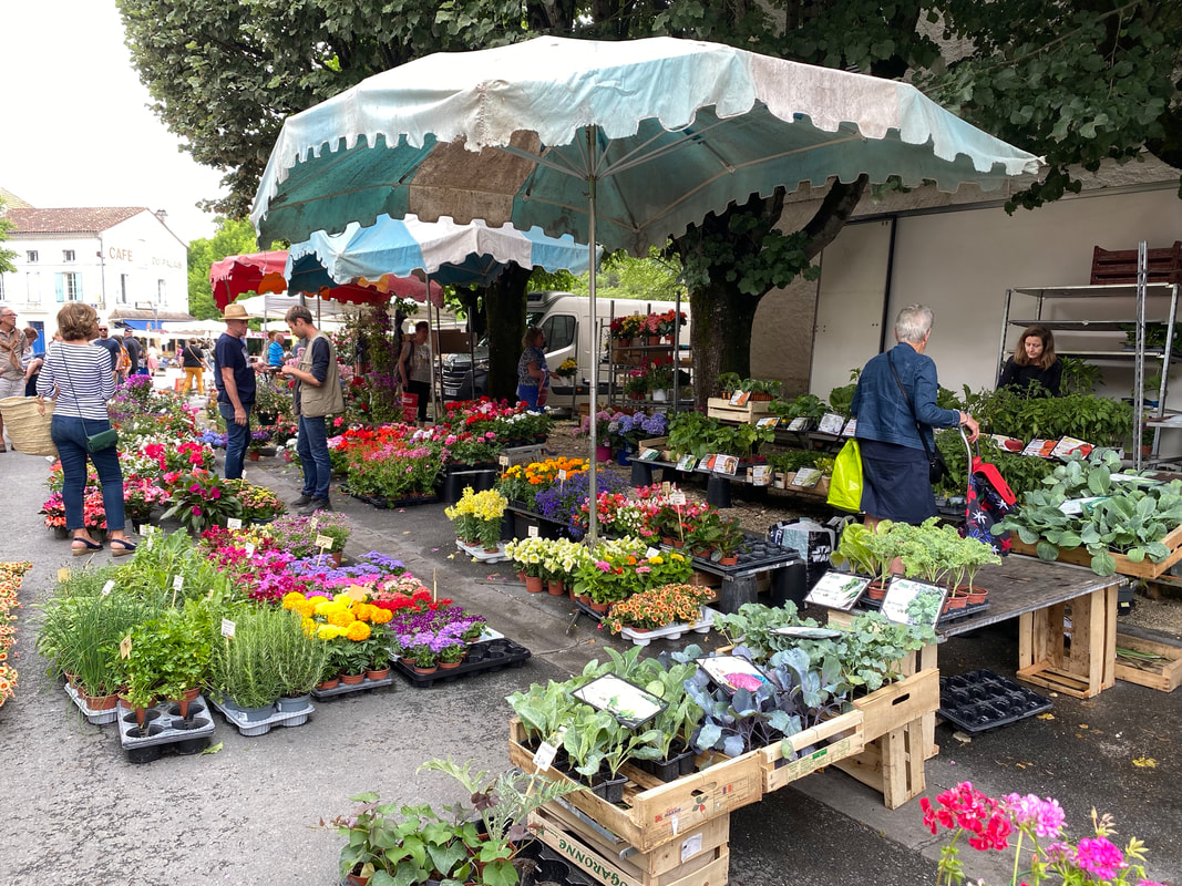
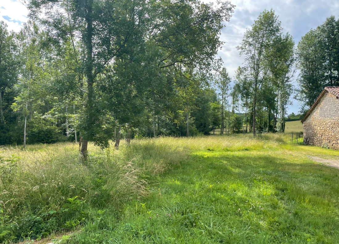
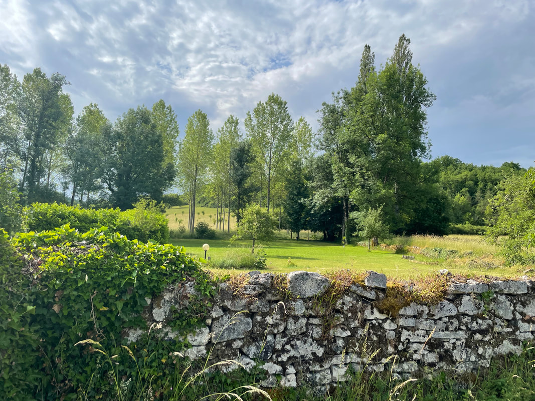
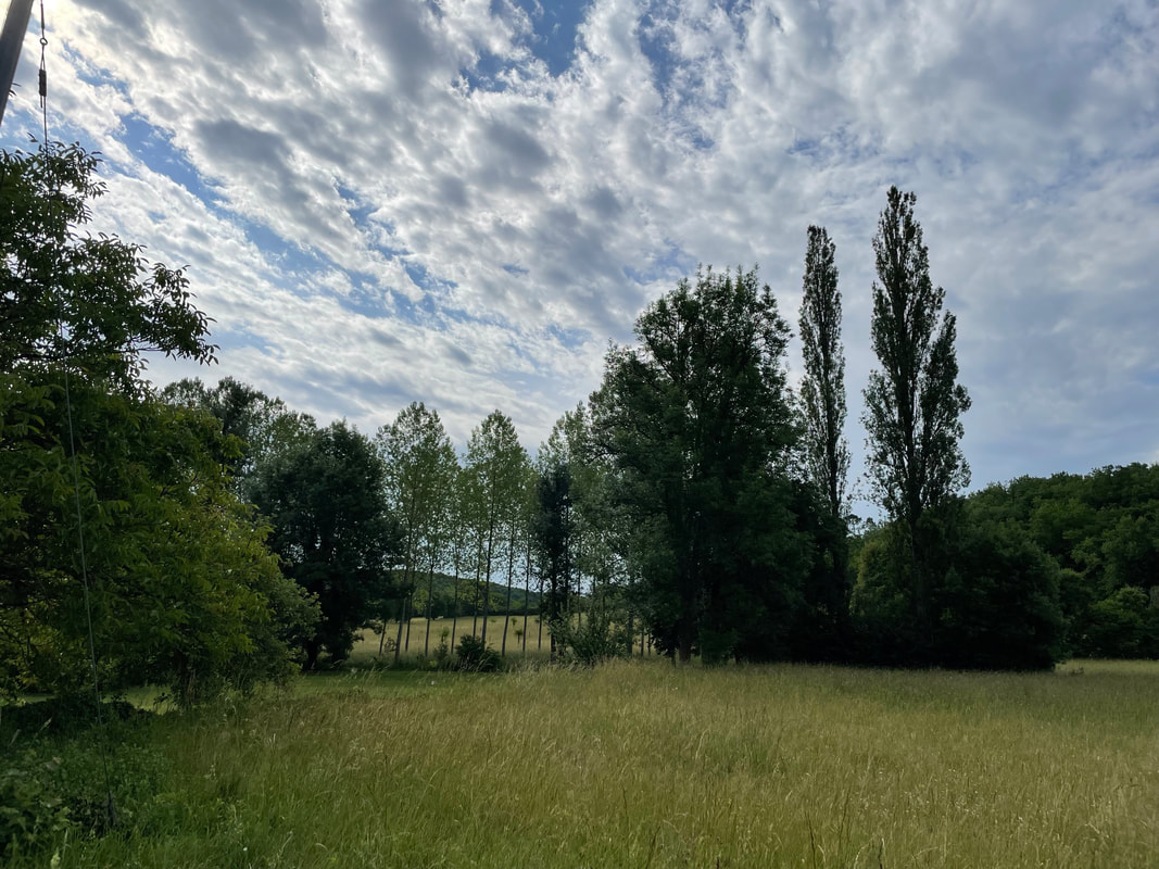
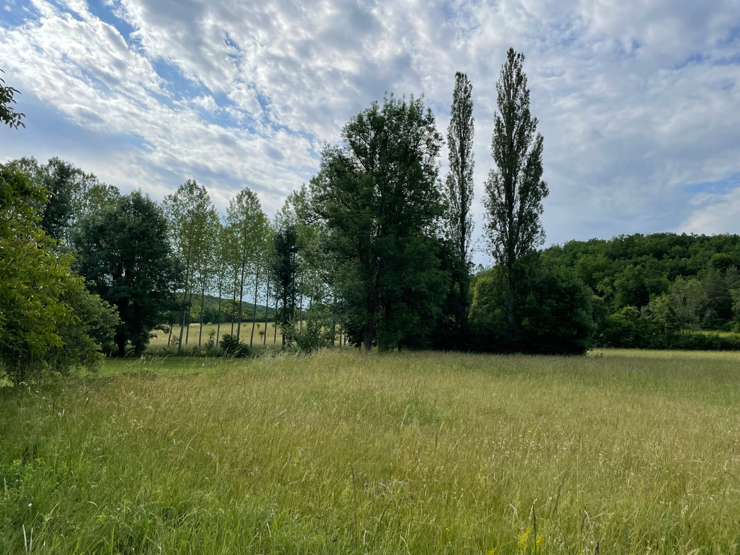
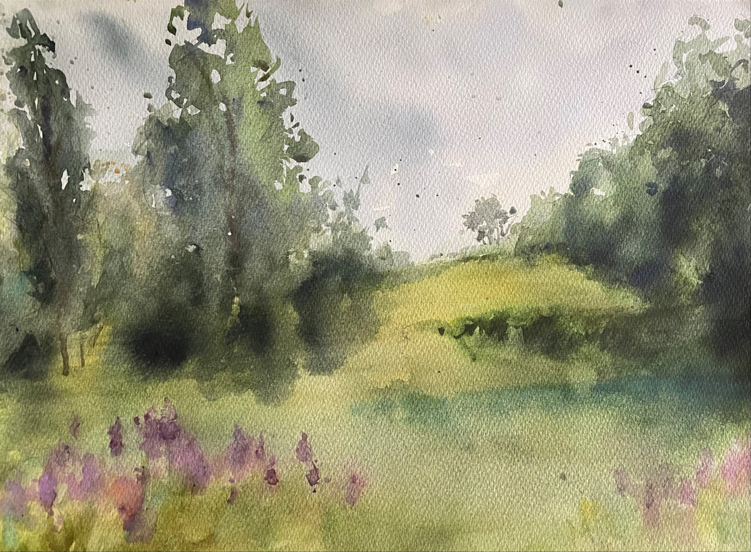
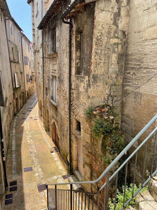
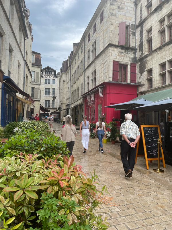
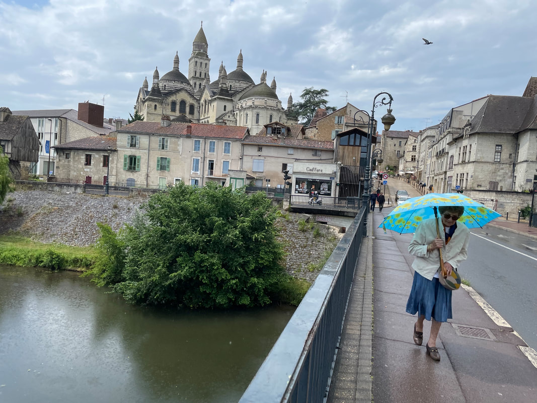
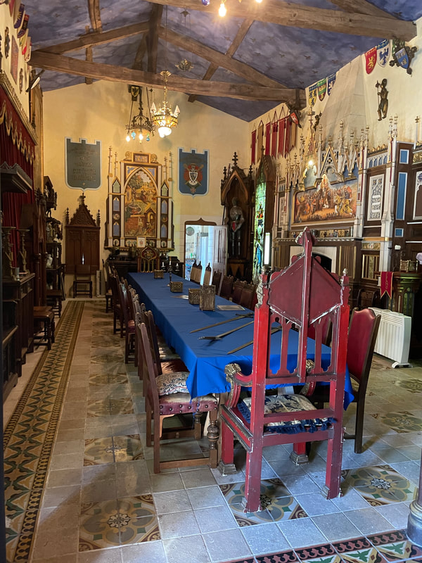
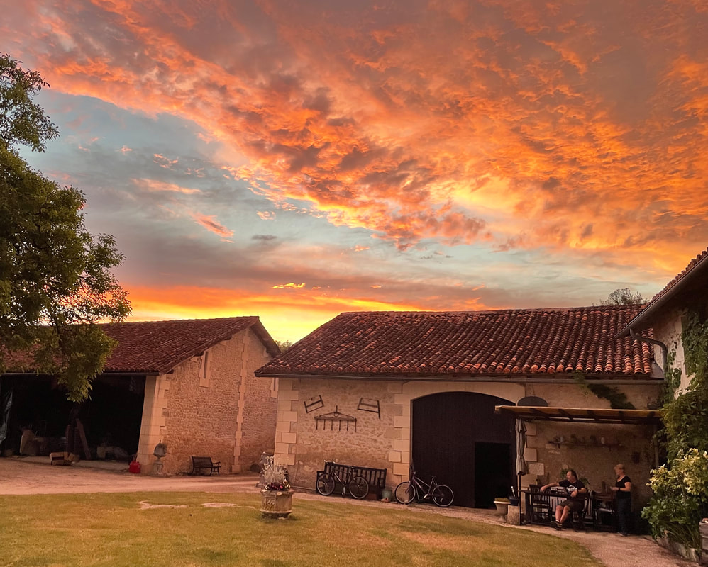
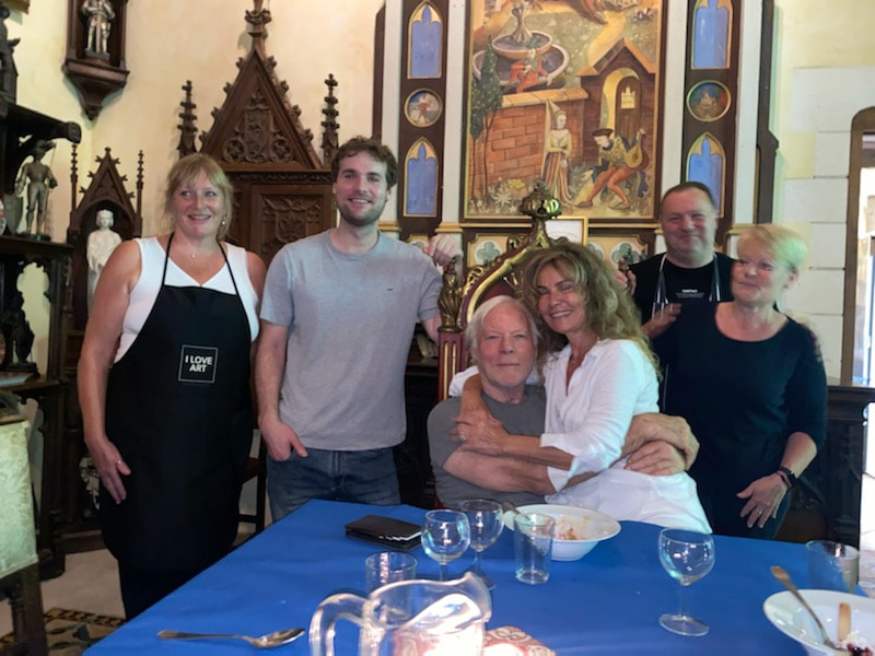
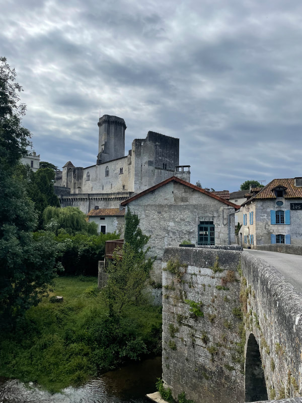
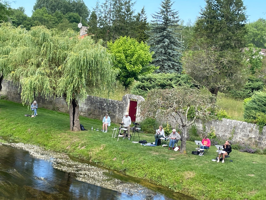
 This is a continuation of my report on our plein air adventure with a home base at this castle in France. Read part 1 here. On the evening of Day 4 the castle chef had the night off, so we had dinner at a beautiful riverside restaurant in Creyssac. On the way home I noticed a stunning view across the field, so we painted there the next morning, on Day 5. It was one of my favorite locations. 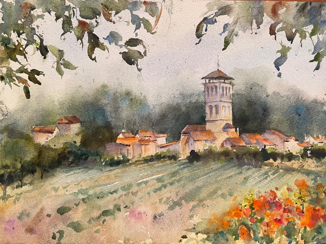 Morning Fields in Creyssac, 10 x 14 original watercolor, painted en plein air in France. SOLD There were also some non-painters in the group who chose to go to Riberac Market that morning. Here are some photos from that location: On Day 6 we started the morning painting a simple countryside scene at the foot of the drive heading up to the castle. It was an absolutely beautiful morning to be painting outdoors. I showed participants some tips and tricks for loosening up and painting fresh and free in watercolor. Everyone loved the simplicity of painting just countryside (see my notes on painting in Switzerland next summer!). (I love the French countryside so much! Jeff and I also set up our easels along the roadside one morning before the workshop began. This is my little painting overlooking the walnut groves near Montgrier.) 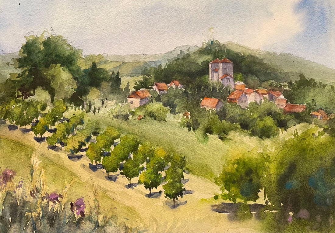 Walnut Grove and Village outside Montgrier, 10 x 14 original watercolor, painted en plein air in France. We spent the afternoon traipsing around Perigeux, the largest city in the region. It was pouring rain, so we took refuge in a beautiful cathedral and didn't get to paint. But the city was inspiring and I will definitely be back. Then it was back to the castle for a final critique of each day's work, one last meal in the big dining room, and one more royal sleep in our posh rooms. 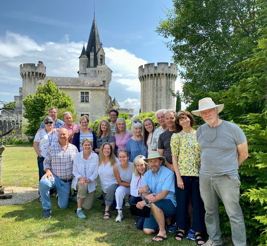 Only a handful of those who joined me on this adventure were already my students and good friends, while the majority I was meeting here at the castle for the first time. But here's the castle's (and the group's) real magic: We may have started out as strangers, but we left as treasured friends. What people are saying:Being with you and the group in France was a highlight for me. Thank you so much for organizing that adventure. -- Nancy S.
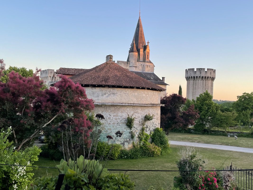
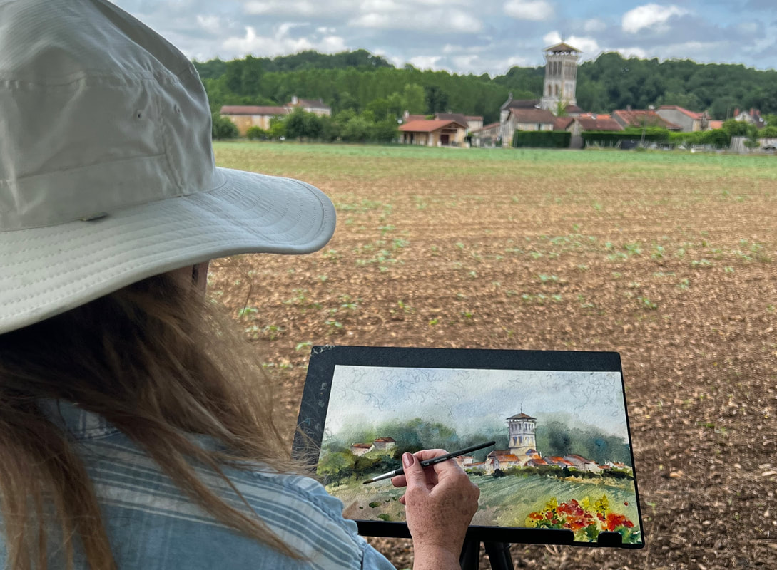
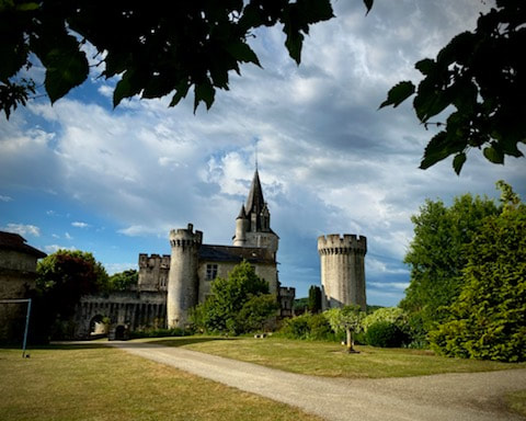
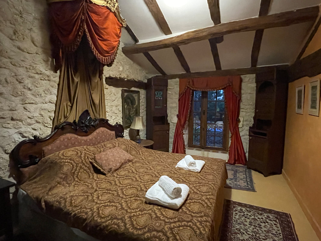
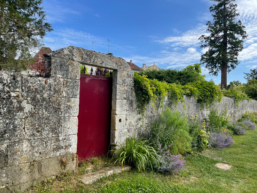
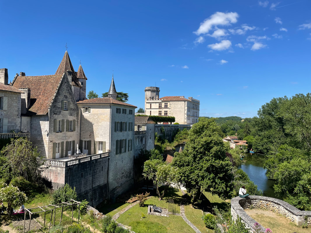
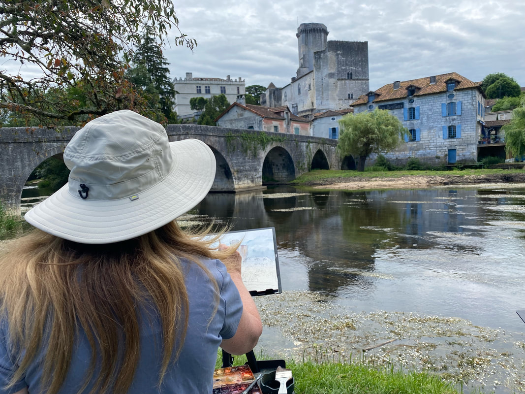
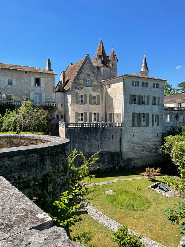
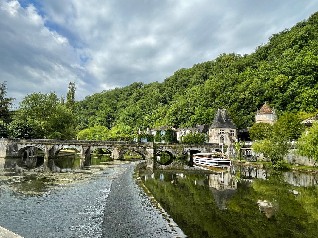
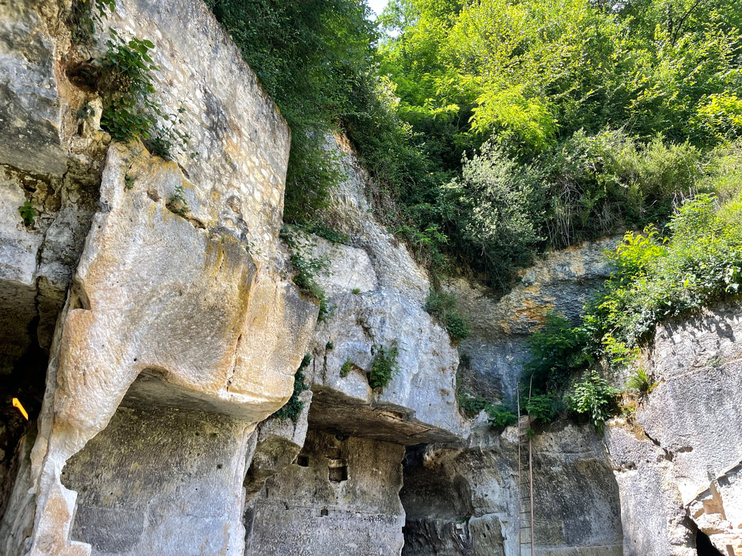
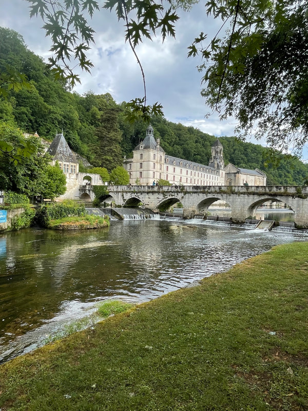
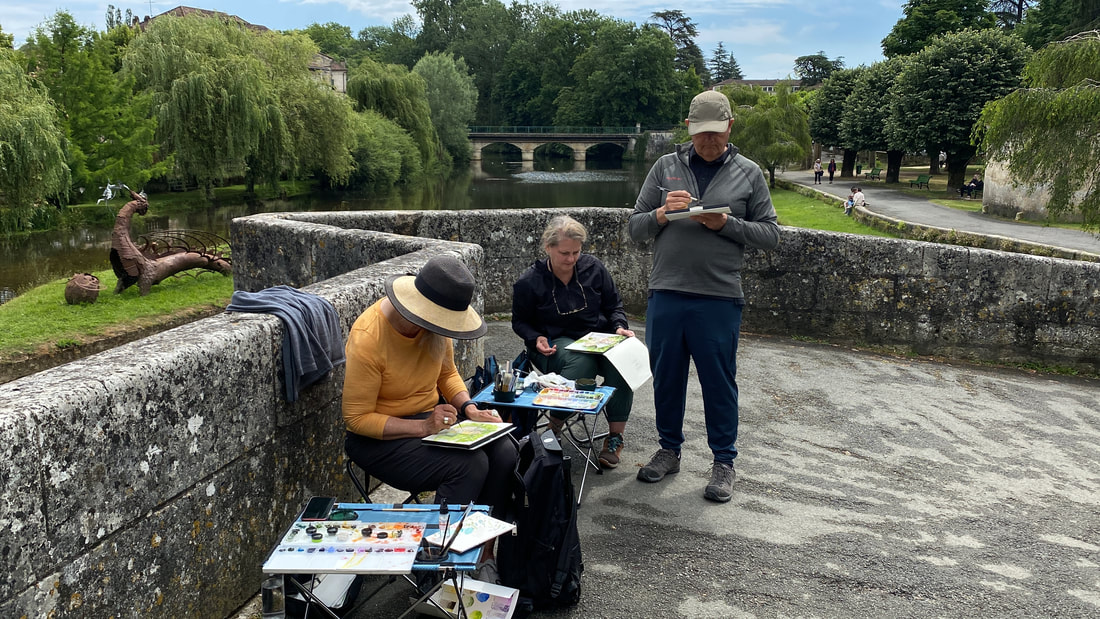
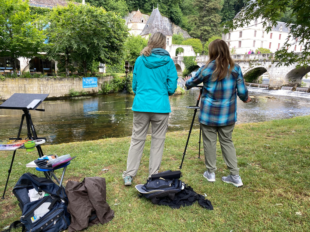
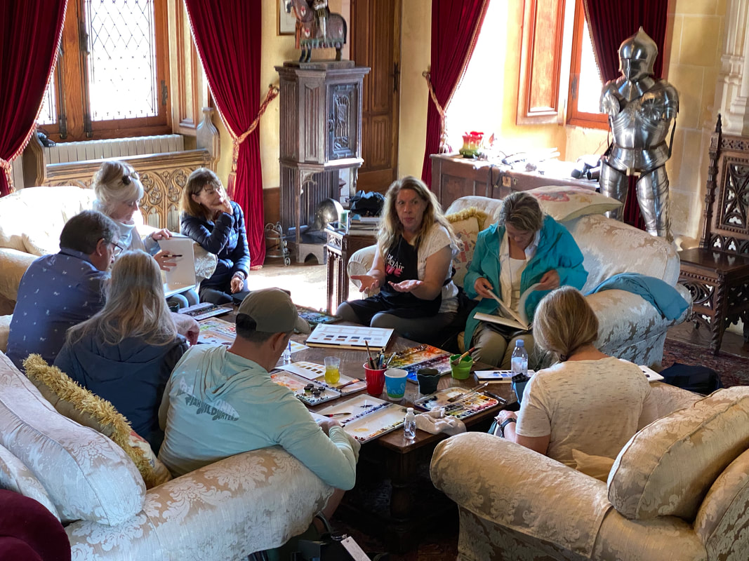
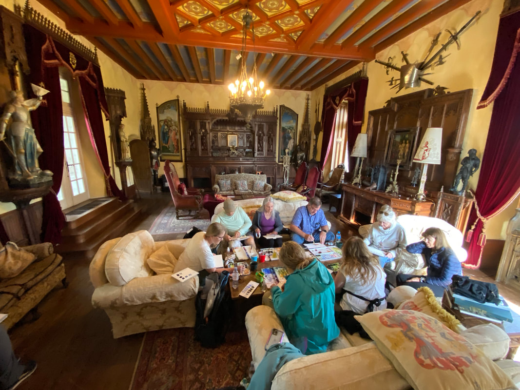
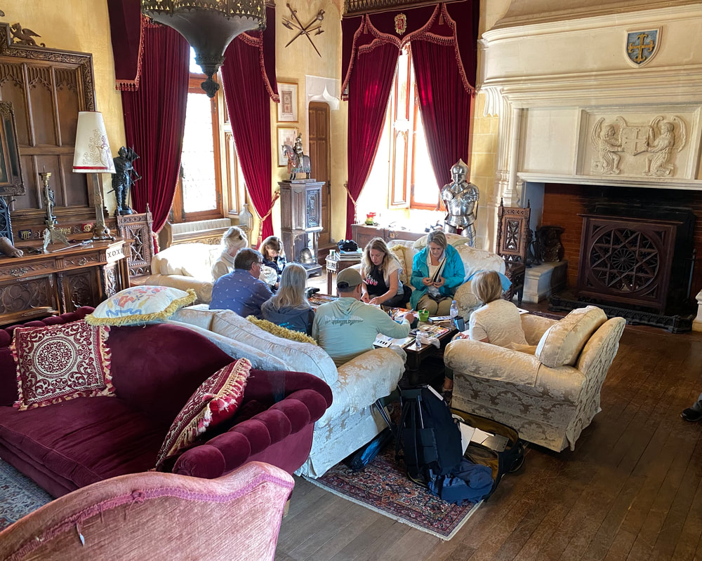
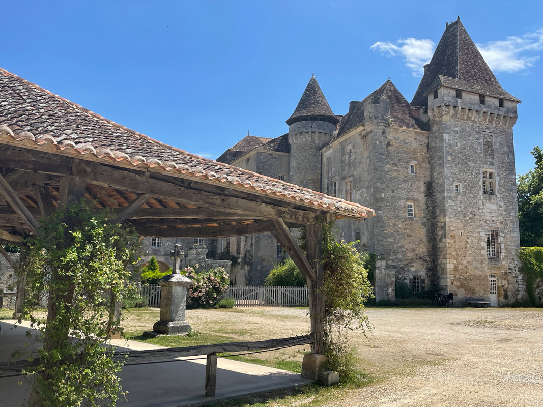
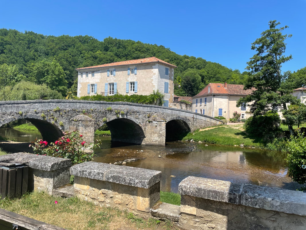
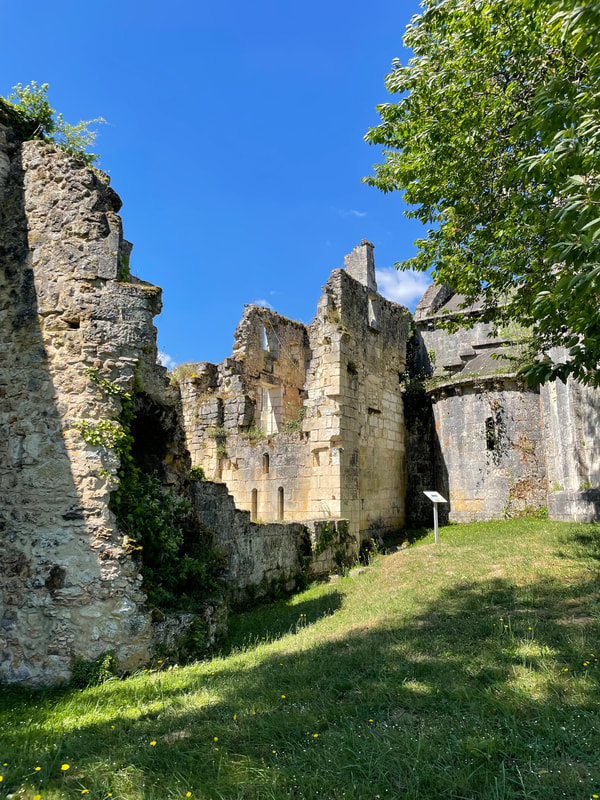
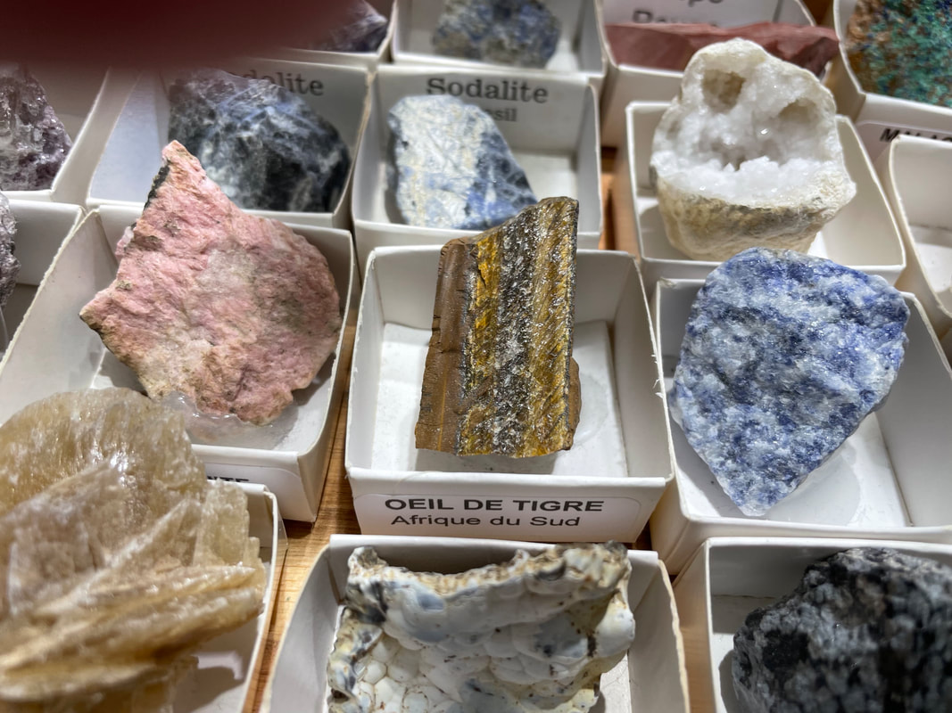
Miss it all! [My husband] asked, "When are we going again?!" -- Laurlyn B. My girls had the BEST time in France with you! Thanks for such a great experience!! -- Tiffany R. What a wonderful group! Thanks to Miles...for sharing this spectacular home. And Jana and Jeff...we felt privileged to share this week. -- Tani B. I can't say thank you enough for creating a dream come true for us! -- Julie S. ...This adventure was beyond all expectations...I learned so much, on so many levels (much thanks to you) and it is all living in my heart and hopefully will be in practice. -- Phyllis B. 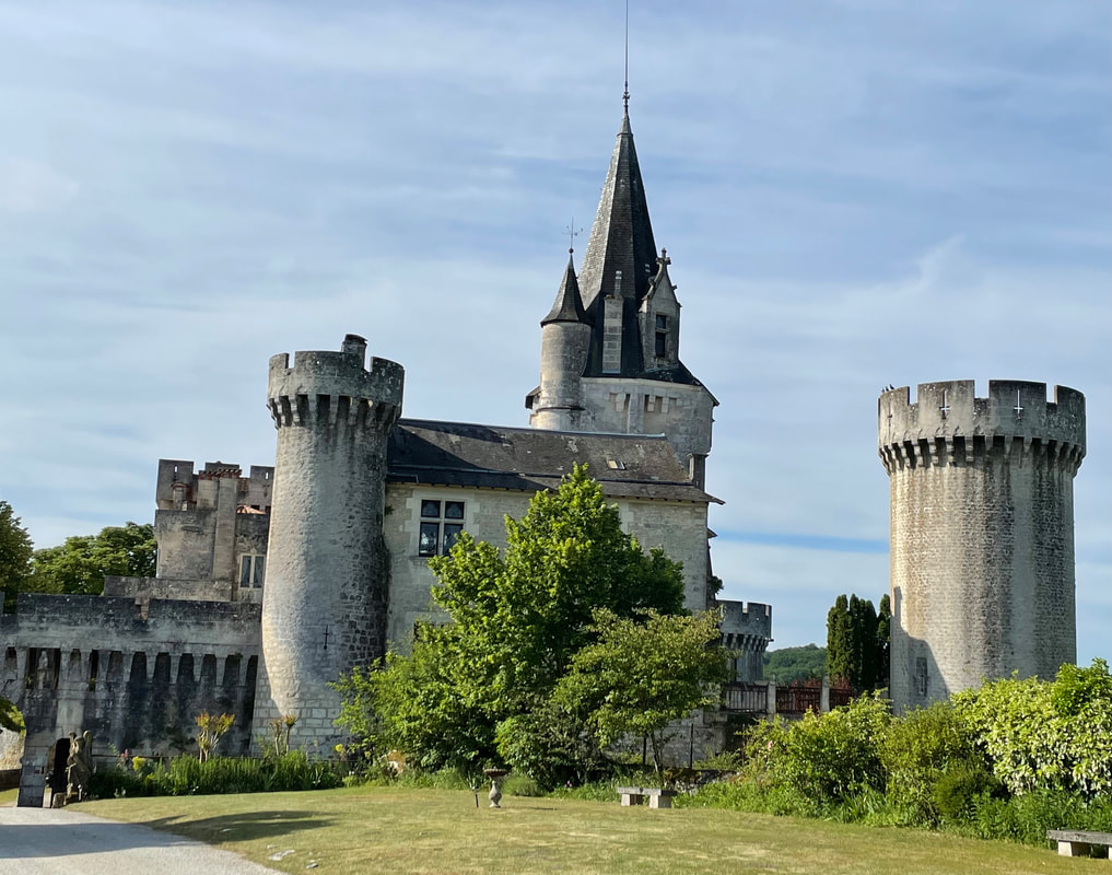 Chateau Marouatte, built in the 12th century, is a perfect spot for artists. We're back from our fairytale painting trip to France...and the castle exceeded our every expectation! We lived in the lap of luxury, sleeping in a suite decorated with period antiques, tapestries, and more. Castle owner Miles Copeland was a delightful, knowledgeable, and entertaining host, sharing a wealth of stories and history about the castle and its surrounding areas. Every day we ventured out to picturesque towns in the countryside to paint. We set up our easels on the banks of the Dronne River in Bourdeilles, across the river from a mill in Brantome, in a field in Creyssac looking up at the village, and more. When we returned to the castle, there was so much to see and enjoy, including a swimming pool, tennis and badminton, walks in the woods...in addition to every little detail on the castle grounds. And then the chef presented us with a beautiful 3-course meal every night. Late in the evening we'd drift off to sleep, dreaming of the magical day that lay ahead. 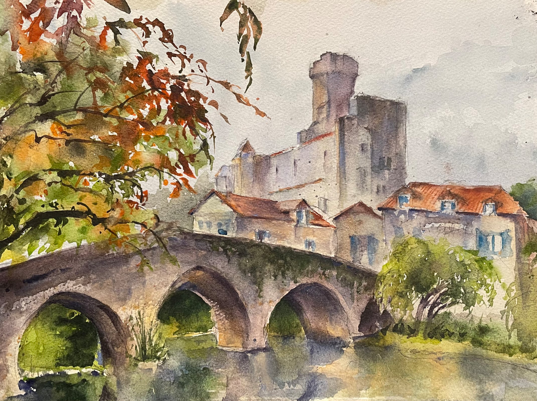 Bridge at Bourdeilles, 10 x 14, original watercolor, painted en plein air in France. Our first outing was to the lovely town of Bourdeilles. After our painting session we had lunch at a local restaurant, toured the castle at Bourdeilles, then returned to the castle where we were staying. The next day we went to another lovely town: Brantome (called the Venice of France). It rained our whole way there, and then magically lifted as soon as we found our spot to point. This was a town I definitely could have spent another afternoon! We ate lunch in a beautiful restaurant, then toured the abbey and caves before heading back to the castle. 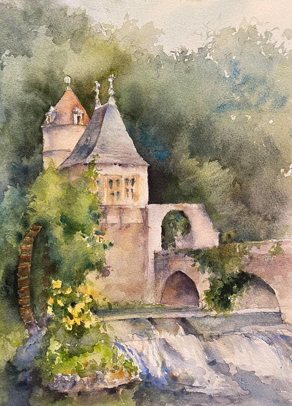 Mill on the Dronne, Brantome, 10 x 14, original watercolor, painted en plein air in France. Our third day out was filled with multiple adventures. It rained in the morning, so I taught an impromptu lesson in the salon of the castle, then we toured the Grotte de Villars caves, complete with prehistoric paintings, visited some 11th century abbey ruins, where there was a potential painting lurking around every corner, and had lunch in the picturesque town of St Jean de Cole. (Yes, the sky really was that blue!) When we went back to the castle I led everyone through an abstract exercise using water-soluble graphite, painting from memory some of the rhythms, colors and textures we saw in the caves, where no photographs were allowed. At the caves I also saw examples of some of the minerals found in the caves, many of which are in my personally curated France/Europe palette, underscoring my belief that using mineral pigments adds additional authenticity to your landscapes. (Tiger's Eye, Amethyst, and Amazonite and Bronzite, to name just a few.) 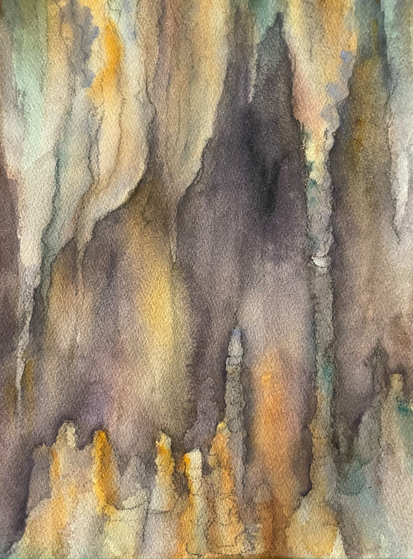 Click here for part 2 of our artistic adventure in France!
 Timpanogos Storytelling Festival at Thanksgiving Point. This image was painted on location and chosen to represent the festival the following year. It appeared on signage, billboards, and all printed material. Prints may still be available. In the next week I'll be boarding a plane to France, living in a castle, and teaching a week-long painting workshop in the great outdoors What to expect A plein air painting workshop varies greatly from the classroom experience. Yes, you’ll see demonstrations in real-time. And you will follow along, and create your own painting. But that’s where the similarities end. Some of the challenges of working en plein air include shifting/changing light, weather issues (wind/rain/cold/heat), time constraints, and the potential overwhelm of being surrounded by sweeping vistas, intricate cityscapes, etc. All of this, however, is far outweighed by the wonder and sheer joy of being immersed in beauty as you paint outdoors. One of the reasons artists have chosen to paint outdoors on location for centuries is this idea of capturing the experience. Have you ever taken a photo of a magnificent spot, only to realize that the result was nothing like what you saw in person, and in fact was downright disappointing? The reason is this: The camera flattens the image, shrinks that majestic background that was so inspiring, expands the middle ground, and distorts the foreground…adding 3-point perspective which makes all the tallest buildings tilt toward the center. This is precisely the opposite of what your eyes do, which is focus on what your brain finds most exciting, and put the rest in perspective. It turns out the lenses we were born with are WAY better than any lens you can buy for your camera…even the expensive ones. I prefer to rely on my sketch and plein air work, and use photos only for color reference when I can. While there are no specific rules governing plein air painting, and there are as many approaches as there are artists, here is what I do on location and what I'll be encouraging my participants to do as well. (Those who have been participating in my Plein Air Fridays excursions already have an idea of what to expect.) First of all, throw perfectionism out. You may or may not produce a good painting en plein air, but the whole point is the experience. And that experience will show up in your finished painting. You are capturing what it feels like to be in that place, hear the birds calling and the breeze on your face, feel the ground under your feet, lending support. You will never forget a place you have painted. You will remember it with crystalline clarity. After painting there, the place will be engraved on your soul. I like to call it “mindfulness on steroids,” and that’s exactly what it is…an intense focus and concentration, an active form of meditation where you are exercising your powers of perception and observation and imitating the expanse of creation before you on your sheet of paper. I usually start by walking around the area, pointing out some potential subjects. I’ll give a brief introduction…what I hope to capture on-site at this location, and why I’m approaching it the way that I am. Then I’ll select a spot for my painting, and start sketching. It’s crucial to simplify. You’ll be painting on a small, 2-dimensional surface. But your subject is a 3-dimensional panoramic vista with an overwhelming amount of detail. So we have to whittle it down. initially you might want to zoom in on one interesting spot of the landscape rather than the entire village and its outskirts…for example, stone steps surrounded by wildflowers. A value study in a sketchbook is an ideal next step. Narrow down your subject to fit in the proportions of your sketchbook page. Find the basic shapes. Simplify it down to just three values. That provides the structure of your composition. I will demonstrate at least one value study on location. Now sketch that out on your watercolor paper. Just block it in, with those same basic shapes and values. I usually start with my focal point, or center of interest, so I place that tower or tree or whatever it is I’m most interested in exactly where I want it on the page, and then build the rest of the drawing/composition around it. Add a few more items for structure and emphasis, almost like placeholders, checking angles and relationships of objects. This initial drawing is more like a quick, hand-drawn map. You want it accurate enough, but not overly detailed. Just a rough indication of what you want to include in your finished painting. At this point I’ll encourage everyone to start their drawings, and when my drawing is complete, I’ll let you know that I’m ready to apply my first wash. You can choose to gather around and watch, or if you’re on a roll, just keep going. It’s completely up to you. It may be helpful for you to at least take a look at my finished drawing for reference. It’s also good to watch the layering process at least once. You may be surprised at how wet and sloppy my initial wash is — which helps a lot with that whole perfectionism thing. It is almost impossible to ruin that all-important first wash (unless you don’t use enough water), and it is the first step toward unifying the whole painting…and eliminating the fear factor (staring at an imposing white sheet of paper). While my wash is drying I’ll come around and take a look at each student’s sketchbook study and/or construction drawing and offer any suggestions. Bear in mind that the time available is limited by the number of participants. Most of the time you will be working independently. Don’t be offended if you see me set a timer as I approach you. This is just to guarantee that everyone receives a comparable amount of my time and attention (which, like I stressed before, is highly limited). I may only have a minute or so to spend with each person...a few encouraging words, answer a quick question, or give a pointer or two. Then I’ll head back to my easel to complete the next step. (Again, you may choose to gather and watch, or keep working on your own.) This process repeats, but as artists become more absorbed in their own paintings, the amount of interaction decreases, as does the size and wetness of the washes. I will be working to finish my painting like all the rest of the participants. So the time evolves into a period of quiet focus. I am always available to answer questions at my easel. And I narrate what I’m doing as best I can. But there is not a lot of time for individual tutoring. The primary value you get from plein air painting with an instructor is a curated location, an introduction and live demonstration, and occasional feedback and encouragement. Keeping this focus in mind will help you get the most out of your plein air experience. Note: We don’t always finish our paintings on location. Everyone draws and paints at a different pace. And it is not a race. That’s why I recommend 300# blocks for this scenario. Even if you have something left to add, you can remove a sheet to continue working, and have a fresh sheet ready to take to the next location. I hope you can join me on an upcoming plein air adventure! Remember: Revel in the Experience, Throw Out Perfectionism, and Simplify. But most of all: Enjoy! 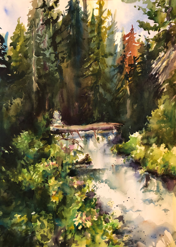 American Fork Run-off, completed on location, summer of 2020 near the Alpine Loop.
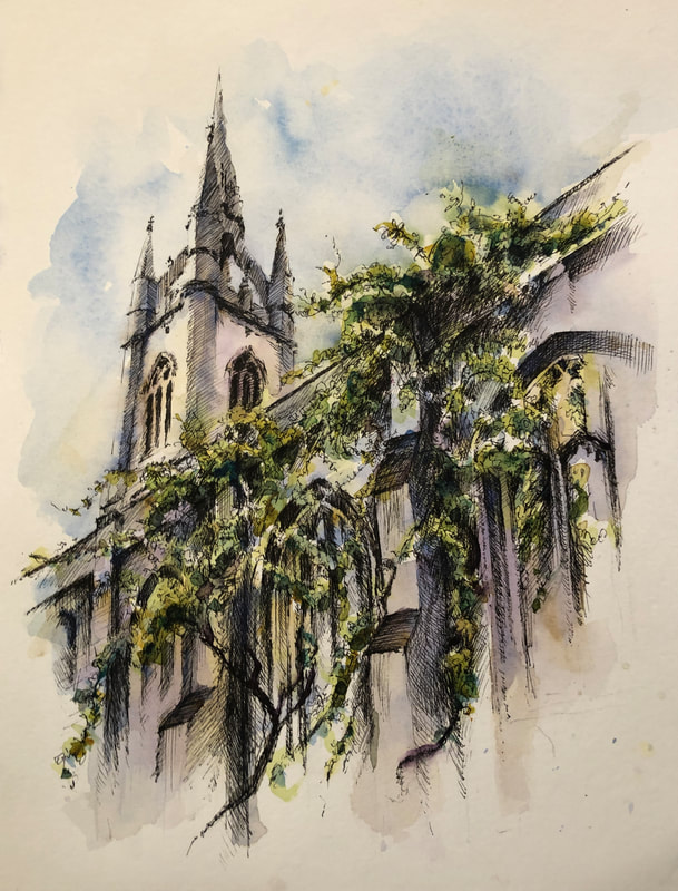 "Green Cathedral," (St. Dunstan-in-the-East, London), original ink drawing and watercolor painting, 9 x 12. Isaiah 42:9-10 Behold, the former things are come to pass, and new things do I declare: before they spring forth I tell you of them. Sing unto the Lord a new song, and his praise from the end of the earth... Psalm 51:10 Create in me a clean heart, O God; and renew a right spirit within me. 2 Corinthians 5:17 Therefore if any man be in Christ, he is a new creature: old things are passed away; behold, all things are become new. Romans 9:6 "...We should serve in newness of spirit, and not in the oldness of the letter." Ezekiel 36:26 A new heart also will I give you, and a new spirit will I put within you: and I will take away the stony heart... and I will give you an heart of flesh. Romans 6:4 even so we also should walk in newness of life. I chose this for the last image of advent as we prepare to move into the new year. St. Dunstan is an old church, mentioned in Charles Dickens' A Christmas Carol, as a tower looking down hauntingly at Scrooge. And yet, St. Dunstan is something completely new now -- after having been partially destroyed by bombs during the blitz of World War II, its empty shell has now become a beautiful and inviting garden, with vines and leaves growing up and through the remains of the structure, lovingly tended. There are benches for those who choose to sit and reflect. It has progressed from an ominous, looming structure to a shell of its former self, to a symbol of serenity and peace. May we all undergo a similar transformation in our own lives. The painting is a vignette, fading out around the edges to allude to a continuation, an ongoing progression, eternity.
I love that Christ came as an infant -- a helpless newborn -- to symbolize that His mission (and one of his greatest gifts to the world) was to create an opportunity for newness for all of us, an opportunity to become new creatures, with clean hearts and spirits renewed, serving in new ways, and ultimately walking a new life. Let's all carry that beautiful sense of newness with us into the coming year. 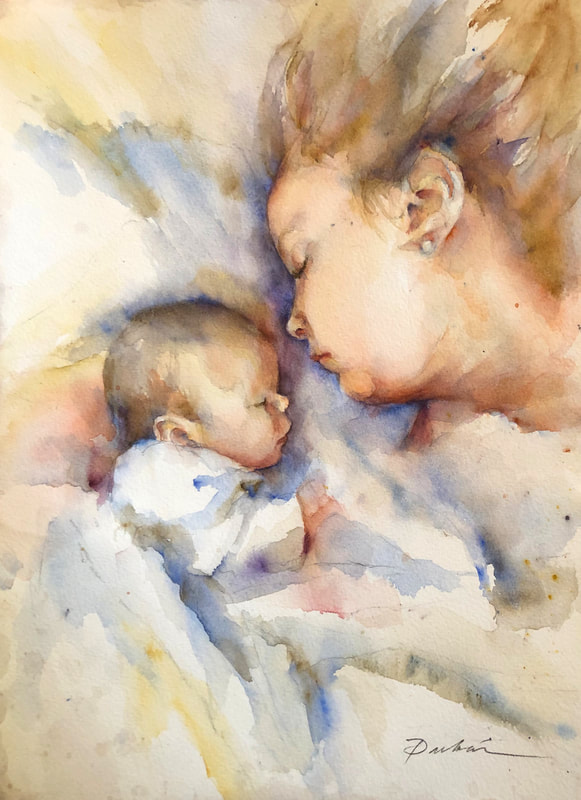 "Jordan and Harrison, Asleep," 12 x 16 original watercolor. Not For Sale. And she brought forth her firstborn son, and wrapped him in swaddling clothes, and laid him in a manger; because there was no room for them in the inn. But Mary kept all these things, and pondered them in her heart. Luke 2:7, 19 One December we had a baby girl, and I was blown away by just how peaceful her presence was in our home, and how sweet it was to have a baby at Christmas, and how everything trivial and unimportant fell by the wayside as we focused on one thing: our newborn babe.
That baby girl is now a mother, and I loved this peaceful moment we caught of her napping with her firstborn son, Harrison--that same serenity I remembered from when she was a baby. I painted this for her birthday last December. How can I refocus my life so that The Newborn Babe is the center of all my attention, and everything else drops off my radar as I bask in His serenity? 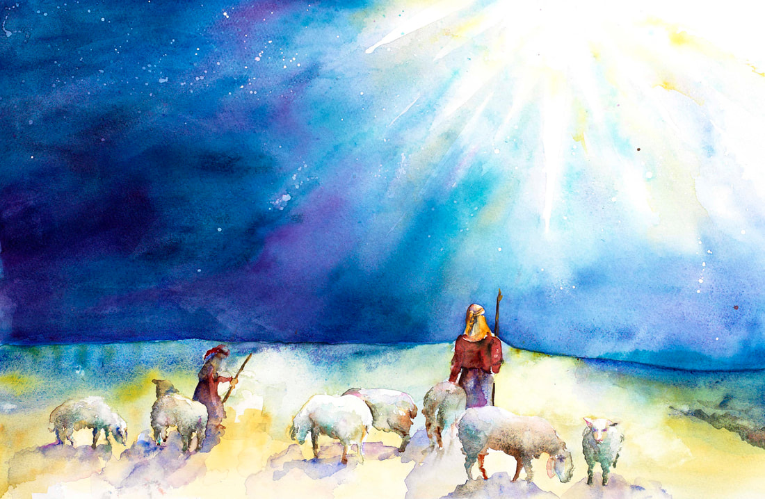 "While Shepherds Watched," 15 x 24 original watercolor And there were in the same country shepherds abiding in the field, keeping watch over their flock by night. And, lo, the angel of the Lord came upon them, and the glory of the Lord shone round about them: and they were sore afraid. And the angel said unto them, Fear not: for, behold, I bring you good tidings of great joy, which shall be to all people. And it came to pass, as the angels were gone away from them into heaven, the shepherds said one to another, Let us now go even unto Bethlehem, and see this thing which is come to pass, which the Lord hath made known unto us. And they came with haste, and found Mary, and Joseph, and the babe lying in a manger. And when they had seen it, they made known abroad the saying which was told them concerning this child. Luke 2:8-17 I am amazed at the shepherds. I love that this joyous announcement came first to caregivers---those who were humbly watching over their charges in the middle of the night. It reminds me of young mothers, up feeding and caring for babies through the night. It also reminds me of teachers -- underpaid and often under appreciated, who work long hours in service to others. I love that heaven smiled upon these lowly servants. I love seeing their their humanity (they were sore afraid) and that they were reassured by an angel. Again, this makes me think of the many human angels who have reassured me in times of trouble and stress. Finally, I love their courage. I love that they show us that witnessing and sharing joy is active, not passive. They decide to act now, they run to see, and they tell everyone they can reach about the joy they have seen and felt.
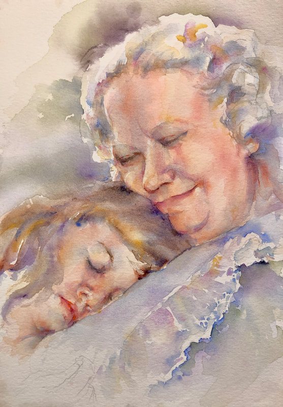 "Comfort, Speak Tenderly," (Grandma Winters with me asleep), 6 x 9 original watercolor. Comfort, comfort my people, says your God. Speak tenderly to Jerusalem, and proclaim to her that her hard service has been completed, that her sin has been paid for, that she has received from the Lord’s hand double... I cannot think of the word "comfort" without thinking of my long-departed grandmother, who was the very essence of comfort and tenderness...and also somehow embodied all things Christmas, including all the love and tenderness wrapped up in the birth of the Christ child. I love this New International Version of Isaiah specifically because it says, "Speak tenderly to Jerusalem"...and to us. If God cherishes us the way my grandma did, then I cannot think of a better place to yearn for, a better voice to listen for.
I have seen so many tender mercies and loving kindnesses from the Lord this year alone, it's impossible for me to doubt his love for me, and his loving guidance in every detail of our lives. I am in awe of his ability to comfort and care for us...even from afar. |
AuthorI am an artist and art instructor working in water media. Just knowing I can watch colors run together makes it worth getting out of bed every morning! Helping students capture the same excitement is equally rewarding. Archives
April 2023
Categories |
 RSS Feed